Clever emails are fun, personal, and engaging. They do as much for the brand which sends them as they do for the customer who receives them.
In this article, we will cover not just the best email campaigns, we will also tell you why it works. If you are here, you are probably looking for inspiration for your new campaign.
If you are indeed in the process of hiring an expensive copywriter, you can evaluate his/her submitted work and if need be, ask for revisions.
The message contained in a brand’s email campaign must be balanced; it can neither be too broad nor too focused.
A less-than-perfect subject line could lead to your email not being opened at all.
Your subject line is a psychological tool; use it to grab attention. You have to ensure what you say in the body is effective in making the customer click on the call-to-action; there’s no space for fluff.
Table of Contents
What is an Email Marketing Campaign?
Depending on who you ask, the definition of an email marketing campaign has minor variations, but it’s all tied to a series of emails.
For an online marketer, an email campaign is a series of emails sent by the business to its leads and customers. Each campaign may be sent with a different objective. All campaigns are measured using email marketing stats, with an aim to improve email campaigns regularly.
For a marketing manager, this series of emails help deliver different types of content and offers to leads and customers. It helps excite users to move them along the marketing funnel. Email marketing is the most effective way to turn your leads into customers.
For a copywriter, an email marketing campaign is a study that teaches the entire marketing team about the audience. He tests different triggers in the subject line and the email copy. The goal of all copywriters is to write non-marketing emails to take unengaged leads and turn them into regular consumers of email, blog, and website content. For marketing emails, the copywriter aims to draw the engaged audience toward the CTA and make them click on it.
Email is one of the most significant parts of an inbound marketing strategy. However, marketers need inspiration too. How to create emails that wow your audience and drive them to take action every single time?
Now that you have had an introduction of email marketing, we will see some key ingredients of a successful email campaign. After that, we will share some of our favorite email campaign examples.
What makes up an effective email marketing campaign?
Modern-day consumers indulge in a lot of different types of media on different marketing channels.
As the online content landscape gets saturated with different types of content by multiple competing brands, email is your best bet to build, drive, and monetize relationships with your customers.
Here are a few things you should keep in mind when creating email marketing campaigns:
1. Know your audience and segment your email lists
You can refer to Google Analytics and Facebook Insights to get a broad idea about your audience in the initial days of content production.
As you start gathering these answers, you will notice distinct patterns and groups among them. These are the initial segments you will use to personalize your marketing communication.
2. Know your goals and stick to them
Write each email with a single, clear goal in mind.
To write a great email copy, keep your text focused toward that one goal. Use that goal to craft a benefits-focused CTA and write copy by drawing the audience to click the CTA.
3. Create opt-in boxes by mentioning benefits
You could use exit-intent popups, time-triggered popups or length-triggered popups.
Your email opt-in box will not convert if you use the standard “Subscribe Now” or “Sign Up” text on CTA. The copy of your CTA should capture this desire to want the change.
4. Write subject lines to make people want to read the content
Subject lines just have to intrigue the users into opening the email.
If you feel that your creativity is blocked, you can take inspiration from these high-converting subject lines.
Remember to avoid spam words like “FREE” or “NOW”.
5. Plan, track, and measure your email campaigns
Plan each campaign to the smallest of details, including the expected action from the receiver.
Measure email stats (open rate, unsubscribe rate, and CTR) to track it and learn lessons from your mistakes.
Test some variations of your emails to see what works better with your audience.
Read also: 4 Reasons Why Your Business Needs Campaign Management Software
Examples of Clever Email Marketing Campaigns
In this section, we are sharing some clever email campaign examples for you to take inspiration from.
Headspace End-of-the-Year Promotion
It’s been just over a few months since I became a paid customer of Headspace and started meditating regularly using the Headspace Library. I love Headspace for its meditation content as well as its marketing communication strategy.
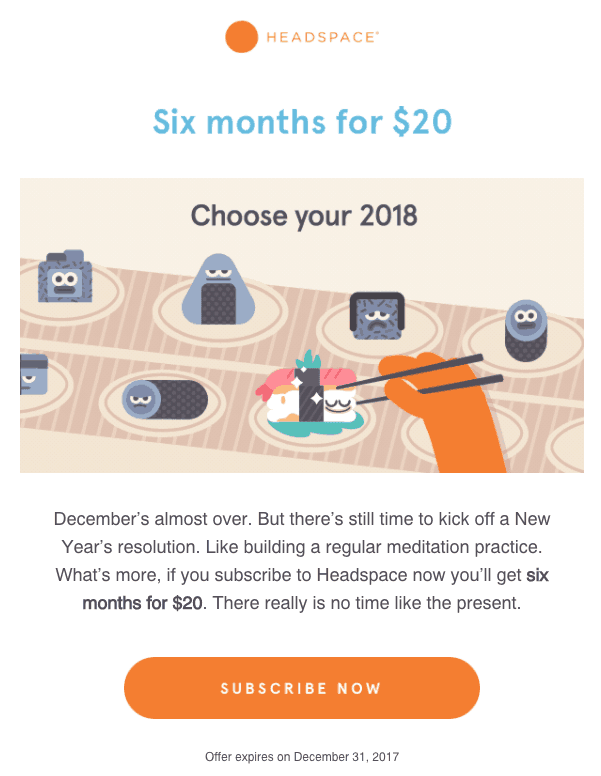
Here is one of their emails as an example:
(Source: MailBakery)
This email campaign was launched to promote a $20 for 6 months offer on the Headspace Library. Right from the email body to the visuals, you can see how much the creators believe in adopting Meditation as a Lifestyle.
The headline “Choose your 2018” triggers the user to concentrate on the image, and the image shows the colorful sushi roll being chosen. This is a really powerful way to communicate the benefits of daily Meditation sets you apart from the rest of the crowd.
Only the CTA is a bit ordinary but it still builds upon the message communicated by the image and text.
Starbucks Welcome Email Campaign
(Source: MailBakery)
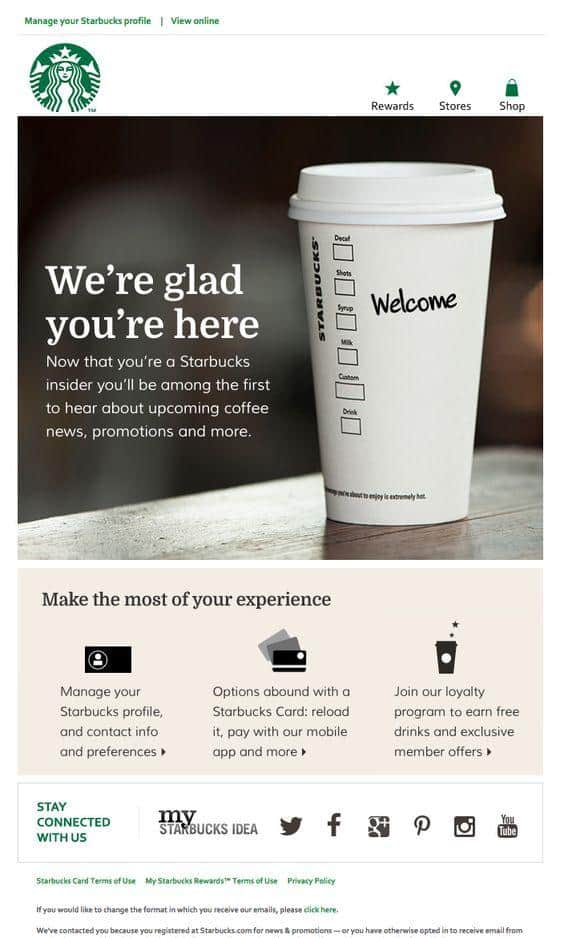
This email is part of Starbucks “Welcome” campaign. It truly sets the tone of the experience a customer can expect from this brand. The usual “Welcome to Starbucks” has been replaced by a “We’re glad you’re here”. The features of their Starbucks account are also succinctly explained with three bullet points.
This email paints invigorating as well as an inviting experience.
Sweetgreen Content Sharing Campaign
(Source: MailBakery)
This is a content marketing email that shares some mouth-watering salad options. Actually, the options are unique and healthy; the email copy makes them tempting. The CTA “Taste the Summer” is also an engaging phrase combining on the action they’re supposed to take and the benefit they will experience after the action.
Dropbox Re-engagement
(Source: HubSpot Blog)
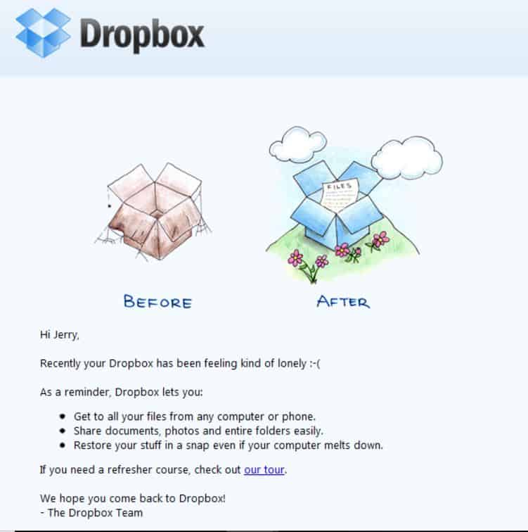
This is one of the emails that Dropbox used to re-engage its inactive users to make them active again.
In this email, the visual is my favorite part. It clearly shows an end state that is more positive and favorable than the start state. Besides the tone of this email copy is not pushy, it makes it clear that this is a gentle reminder.
I also love the fact that they used bullet points for easy reading as well as the use of benefits instead of features in those bullets.
Trulia Sharing Targeted Content with its users
(Source: HubSpot Blog)
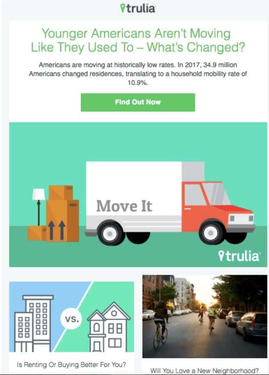
Trulia – a search engine for real estate sellers and buyers – stays abreast of the real estate industry trends. It’s something that interests its own users.
So, they keep a tab on industry trends and don’t forget to remind its users the same with emails like these.
Check out EngageBay’s Real Estate CRM to grow your business.
Artifact Uprising asking customers to take a survey
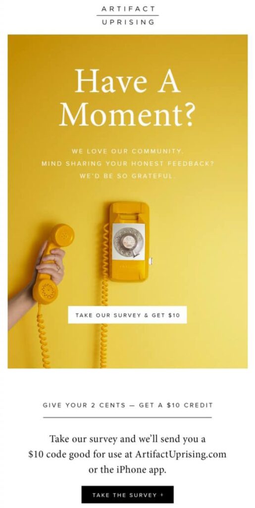
They create customized photo books and other gift items. This example follows a very basic rule for email campaigns – make it visual! The image they have used symbolizes that “the lines are open”. They have also used the simple, minimal design with yellow as the main color; it grabs the eye immediately.
What I like most about this email is the purpose they have used it for. Customer surveys are the toughest to generate clicks on the CTA. People usually will click very quickly if it is a sale where they are saving X dollars. So they paired this lively image with a $10 gift coupon.
J.CREW tempting users into a sale
Who doesn’t like ice cream? Answer: Everyone loves ice cream.
J. Crew wanted to lure customers in for a sale, so they put a universally likable item to great use. The image begins with a short sentence promising a guaranteed feel-good return at the end of the scroll. As customer begins scrolling down the large ice cream, he might think he is getting a sweet treat. Curiosity is at a peak when the user reaches the end. Instead of directly answering “what this email is about”, the email ends a rather mysterious black CTA button with one word “Go”.
This email relies on minimalism and sound psychological principles to make the customer click on the CTA.
Uber Calendar Sync Persuasion Campaign
There are so many taxi-hailing apps. None of them has been as successful and loved as Uber. What I love about Uber is its no-nonsense approach to user experience. The moment you fire up the app, you are selecting your destination. You don’t waste time in clicking on irrelevant messages; the app takes you right down to business.
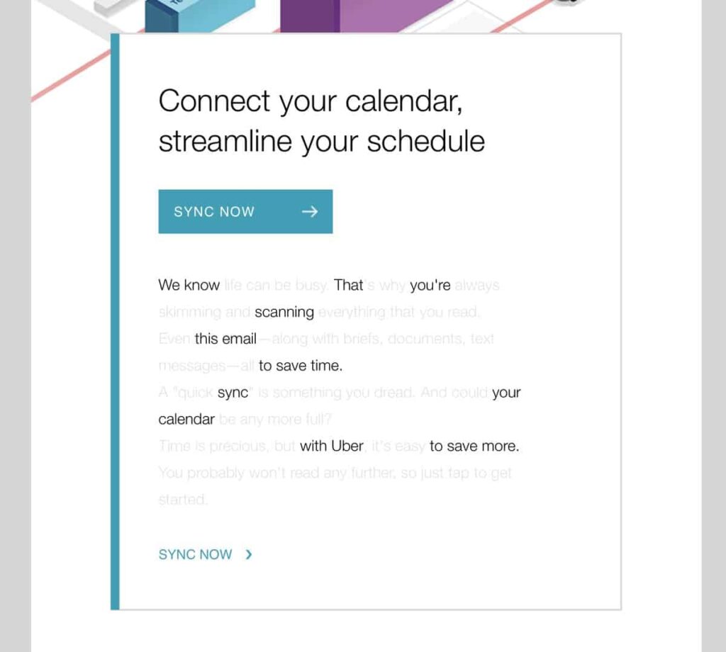
The same is often reflected in Uber’s email campaigns too. The example given below is an email for brand loyalty which attempts to persuade the customer to link their calendars with the Uber app.
It is minimal and very cheeky. Look at the way they used text to mimic the mental state of anyone who is reading a promotional email. This is one of the cleverest campaigns you will ever see. If I could, I would frame it for my company’s wall.
Poncho Customer Engagement Campaign
This is by far the most creative ad I have ever seen. Poncho is an app which simply sends weather information – via a cat. The messages sent by the app are not exactly very peppy but the fact that they’re delivered by a cute cat actually makes you look forward to the routine weather message that otherwise doesn’t have any scope for creativity.
A full email just with the weather information? Why not! Just have a look at it – The copy is minimal, the graphics are highly engaging, and the message really feels like a cat is talking to you! Their CTA invites you (again, very creatively) to connect outside email.
Postmates Product Promotions
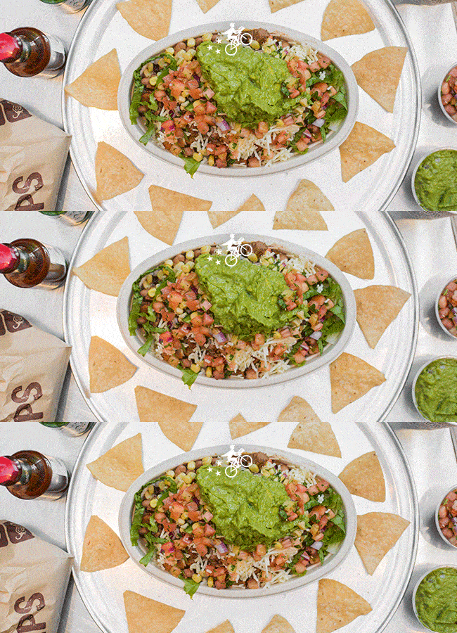
I hate promotional emails that pack huge chunks of text. That’s lazy, almost callous copywriting. No matter how catchy your subject line is, if your email is full text, it’s not going to convert much better. So images are used to connect with our audience.
This Postmates campaign takes this interaction to a whole another level – with GIFs! It teases, tempts you about the product.
Their text after the GIF is short and peppy. This is such a good campaign, that you will almost miss a 100% delivery charge which doubles the price of the final delivery (read the fine print at the end). If sent at the right times (when people are hungry), this email is sure to convert at a really high rate.
HireVue Subscriber Reactivating Campaign
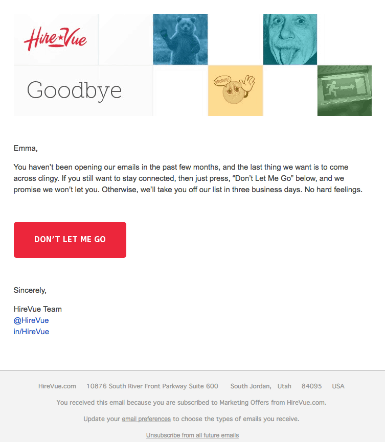
When your email list fails to convert, you shouldn’t just give up. You should do what HireVue did – send unsubscribe emails. When they send this kind of email, the customer has usually lost interest and engagement from them is almost nil, but is still subscribed to the list.
The solution from HireVue is an email to attempt to bring the customer’s attention back to the brand. While it may seem desperate, the wording is very matter-of-fact and classy. It is indeed very smart because it uses the psychological trick of “consent” to grab and retain the customer’s attention. If the user clicks on the CTA, he has already said “yes” to an important question asked by the email. Now he will be more attentive when HireVue sends more emails.
Urban Outfitters Subscriber Reactivating Campaign
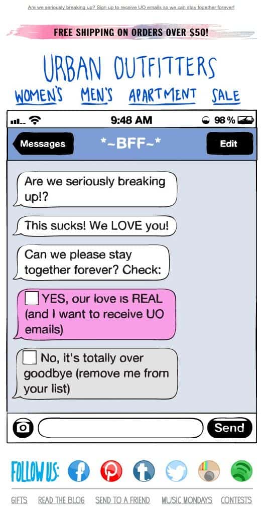
Subscriber reactivating campaigns aren’t so uncommon; they reignite a dead part of your email list. They need to be done very creatively, or you may risk getting labeled as cheap. A very good example of a creative reactivating campaign is this email shown below from Urban Outfitters.
It shows a chat message window with emotional (non-creepy) messages in a playful font. They have made choices look like checkboxes but they behave like hyperlinks. In the end, social follow links are also very eye-catching. This is yet another example of why precise messaging delivered creatively always works.
J.Crew inviting customers for a sale
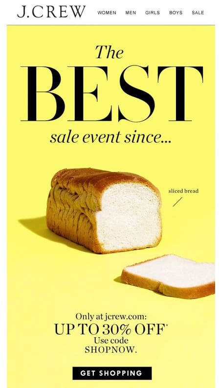
When it comes to creative email campaigns, JCrew seems to be a master of surprise and conquer. In this email below, the graphic is a loaf of sliced bread. It has nothing to do with the brand (an online clothing retailer) or the email subject (announcement of a sale). Its only purpose is to be funny.
Who doesn’t want to have a good laugh? The CTA is plugged in so brilliantly that it almost guarantees a click every time someone opens the email.
Estee Lauder offering free samples
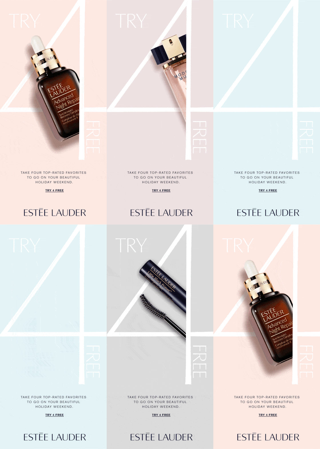
GIFs are not only brilliant customer engagement tool for brands, but they also help you keep your messaging minimal – a common trait among most successful email campaigns.
It grabs attention immediately. Even though the messaging in this Estee Lauder campaign is fairly basic, it’s offering free samples, which everyone loves.
Need Supply offering birthday coupons after the birthday
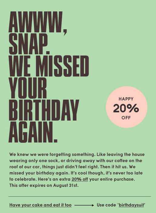
While this one is not as minimal as others, the text is very personal, quirky, and not too long. The element of surprise of receiving a birthday coupon after the birthday hits the customer hard and gets him thinking. This is one of the smartest ways of pushing an extra sale each day. Just set a trigger to send these emails every day to customers celebrating their birthdays on that day.
Pointers for smart email campaigns that convert
As we have seen, it’s not rocket science to generate email campaigns that catch eyeballs and convert equally well. The messaging needs to be visually minimal in its design, and have an element of personality. It could be crazy, it could be funny – it could be anything which people want to see. Imagine the kind of traits your buyer persona would be looking for in a friend and try to project those traits through your email copy campaigns.

