The AIDA model is gone. As modern marketing evolves, this once-indispensable pillar is pushed to the past tense; it’s rendered as obsolete.
Today’s consumers expect brands to predict their needs. This is no longer a reliable funnel as it was 5 years ago.
Its replacement is the flywheel as championed by HubSpot.
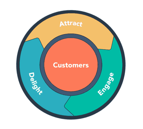
(source)
To make the flywheel work for you, you have to give it some leads. These leads go as an input to the “Attract” phase.
To attract new leads, you need a high-value lead magnet. It’s a free document or a report that showcases your authority in your niche. It’s offered for free (technically). But the visitor will share the email to get the lead magnet mailed to get him/her.
The form where you capture the email is placed on a special landing page called Squeeze Page. Another name for a squeeze page is a “Lead Capture Landing Page”.
The landing page can be broadly defined into two parts:
- Landing page copy (which includes the CTA copy)
- The Lead Capture Popup
Finally, we will also tips and tricks to write the irresistible, highest converting landing page copy and cover your bases with an optimized, high-converting lead capture form.
Table of Contents
Why have Lead Capture Landing Pages
A lead magnet is a piece of digital content in a format suitable for the company to produce and the audience to consume. A free lead magnet is important if you want people to trust you with their email addresses.
The most common lead magnet is an e-book because they’re easy to produce and consume. There are reports, videos, and webinars which can be effective lead magnets. We will also give you a list of effective lead magnets later in the article.
Using an inbound technique, you drive people to the lead capture page. The page presents the lead magnet to the visitors, who are not yet in your leads’ database. This presentation is enhanced by the sales copy of the page. It attempts to entice the visitors about the lead magnet and encourages them to click the CTA (Call to Action) button.
The visitors enter their email address to receive the valuable artifact for free into their email. This is the typical workflow that uses landing pages for lead generation. These are all major components of an effective lead capture strategy.
For example, the lead magnet employed by WalkMe is their free trial. They have a landing page that uses good copy and a CTA to get more people to start the trial. This is an ideal example of a great way to capture leads.
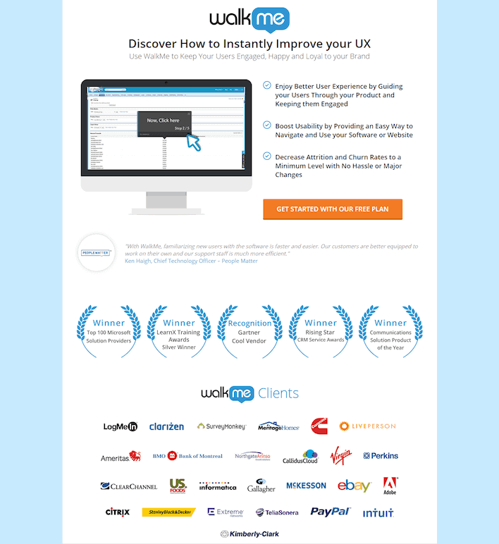
(source)
Perhaps the one thing that they can improve on this page is to fix the weird capitalization in their headline.
A more common version of this workflow is when the lead magnet is deployed on an exit-intent web popup as a lead generation method.
What objectives is a lead magnet supposed to achieve?
If you want your lead magnet to be effective, you must optimize it for two important goals.
Attract a suitable audience
Every lead generation executive will agree to this truth about lead generation:
Quality and quantity of leads are both important.
If your lead magnet attracts too many unqualified leads, it’s not a successful one and needs to be reworked. It might be slightly better than your previous lead magnet, which caused the lead generation numbers to dry up completely.
You don’t generate leads only to reject them later. If the landing page doesn’t help qualify all those leads, they’re automatically going to be rejected at a later stage.
It still is an average standard of performance, you can get more qualified leads with your landing page.
If you believe in the school of thought that says “No lead is a bad lead”, then you better have a great product, great customer service, and unbeatable pricing which the client can’t find anywhere else.
In short, to have the freedom to accept any and all leads, your business needs to be exceptional in ALL areas.
Have a look at Zillow landing page for Premier Agent. Look at how the radio boxes are being used to qualify the type of lead right in the form. This is one of the better lead capture page examples.
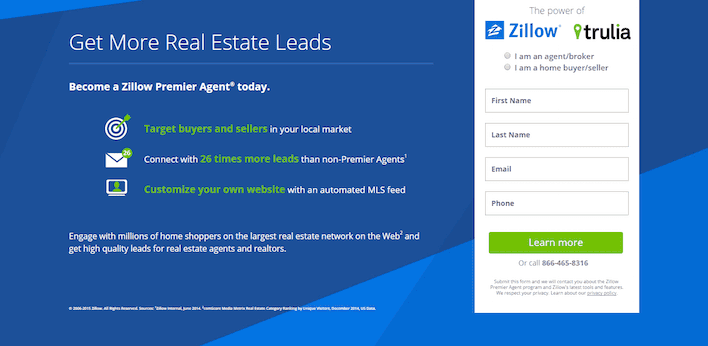
This information will help their sales agent and will inform their marketing communication. Because they know the type of lead, they can structure their communication right from the start to suit their needs.
In the latest design, the page has changed the radio buttons to drop down, which still does lead qualification brilliantly.
The importance of having the right audience cannot be understated. When you don’t create with the focus on the right audience, it shows. Your lead magnet may get a higher number of leads but chances are, most or many of them would be unqualified.
To create a focused lead magnet, keep these 4 points in mind:
- Promise them something specific to be delivered to their email
- Make sure the target audience gets it clear who the artifact is meant for
- Mention all key benefits the lead would get by downloading your lead magnet
- Mention the most important benefit on your Call to Action. Write the copy surrounding the CTA with the goal of getting people to click the CTA.
- Position them for a purchase
When your lead lands on the squeeze page, your lead magnet must provide everything that your landing page promises. Quality is a must. Not providing value (or providing low-quality value) in the lead magnet hurts your brand.
You can, however, do a lot more than just provide quality. You can actually position yourself in a way to get more sales.
Recall that lead magnet enters the lead into the funnel. When you have to position the lead magnet for selling, you get to move the lead further into the funnel.
This doesn’t mean spamming the entire ebook with purchase links. You don’t have to put a selling link in every section.
You have to find smart ways to sell.
As an example, let’s have a look at an eBook for creating eBooks. This ebook is created by Jessica Meher of HubSpot and shared in partnership Unbounce. At the end of every page, the footer has social links asking readers to share the guide.
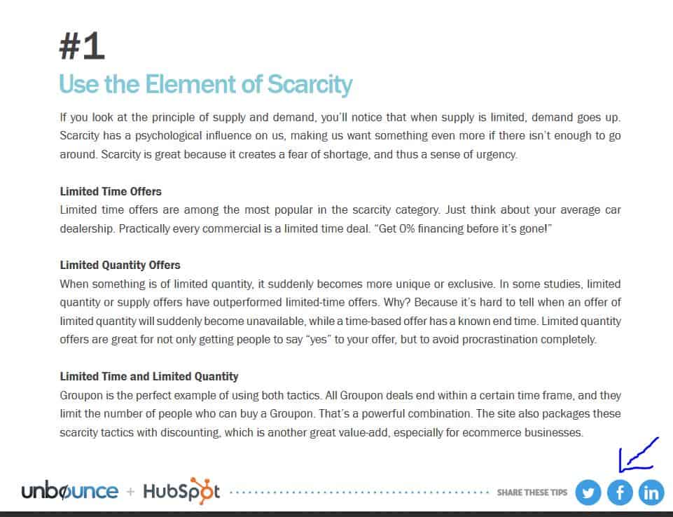
For HubSpot and Unbounce both, this is a great key to further their branding via the ebook.
The simplest way to create a free resource that sells is to be aware of all the resources/products/services that you sell. Once you have that list, add a short, persuasive pitch in text/audio/video format.
Finish the lead magnet content and deliver the content at the end.
Read more: 20 Of The Best Product Landing Page Examples Online
Why are lead capture forms different from your homepage?
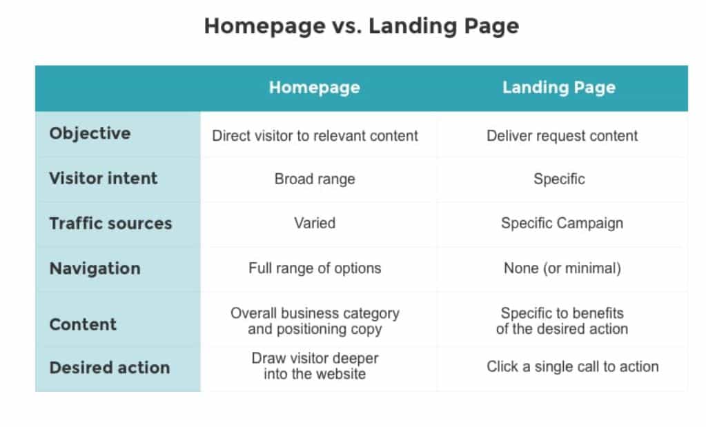
The best way to understand the difference between your lead capture landing page and your homepage is this:
If the homepage is your “table of contents” of the book, then your landing page is “a single chapter” (blockquote).
The homepage presents all products and all the services that you offer. The free lead capture page has just one. It focuses on promoting one thing – your lead magnet.
This is why your homepage will have many internal links to different parts of the website. The cardinal rule of landing pages is to have minimal navigation.
(source)
You have usually one homepage or one feature page for each feature (acting as the homepage for that feature). Lead capture pages may not be tied to features, they’re tied to offers/lead magnets you use for lead generation.
How to optimize your Lead Capture Forms for Landing Pages?
A lead capture form is the hero of your landing page. It’s obvious that your hero demands most of your effort and your time.
Here are the keys crucial to a high-converting lead capture form:
- Position the form relative to the length of the landing page. If you spend a lot of page length explaining the lead magnet, prefer to keep the form below the fold. Simpler offers with short landing page copy can put the form above the fold.
- As a thumb rule, a lead capture form with more than 5-7 fields is off-putting. At the same time, if you ask the lead to enter only name and email, you will get unqualified leads. Pick the most important lead qualification criteria for your business. Narrow them down to 5-7 fields. Replace drop-down controls with radio buttons or checkboxes (it saves the milliseconds of time spent in clicking the drop-down).
- It’s still possible for the lead to have certain anxieties about the content you will offer or how you may use their email address. To help with this, add links to your “Privacy Policy” or “Terms and Conditions” or both, near your CTA. Alternatively, you could also add a small anti-spam notice to assure the lead that their email address won’t be misused.
- Your CTA button should use a color that is in contrast with the rest of the website theme. It should be large and noticeable, but not so large that it takes the focus away from the content on the lead capture landing page. Finally, the CTA copy should include the one key benefit of the offer to help visitors directly relate to it.
If your CTA button is placed according to the F-Pattern or Z-Pattern (in the right sidebar), customers can’t miss it. A CTA button placed on the left side of the content or in the left sidebar is at high risk of being missed.
How to design a lead capture page?
Making a lead capture page isn’t hard. But it isn’t easy either. It’s a lot like learning to cook Lasagna for the first time – you bring all ingredients together, and you follow the recipe to the T and you expect it to turn out delicious in the first try.
That might not happen always happen. All first-time cooks learn patience with time and are eventually able to turn out mouth-watering Lasagna after a few average attempts.
Just like amateur cooks, the first-time lead capture page designers will benefit from low expectations. With the right amount of experimentation, it’s always possible to create your highest-converting lead capture page (and your most delicious Lasagna).
And just like amateur cooks, you have got to refrain from comparisons. Just because someone else is creating a more successful landing page in your industry doesn’t mean you cannot. Website page capture is an art. Patience pays rewards!
Things to include in a Lead Capture Landing Page
Do you want to create a high-converting lead capture page? These are the elements you should include:
Headline that hooks audiences’ attention instantly
If you want to create a landing page that people want to read, your headline must grab attention quickly. A good headline promises a pleasant reading experience, a crappy headline will make it difficult to move forward.
Implementing message match is the easiest, most natural way to grab attention. When your visitor clicks the link to a page, it takes a few seconds (maybe more) to load the page completely. A message match ensures your visitors don’t lose the concept of the offer during this delay.
With message match, your visitors will be able to relate the landing page with the source page where they clicked the link; they won’t lose the thread.
And let’s not forget – your headline is meant to help sell your lead magnet. So, including its USP is a must. Focus on benefits over features.
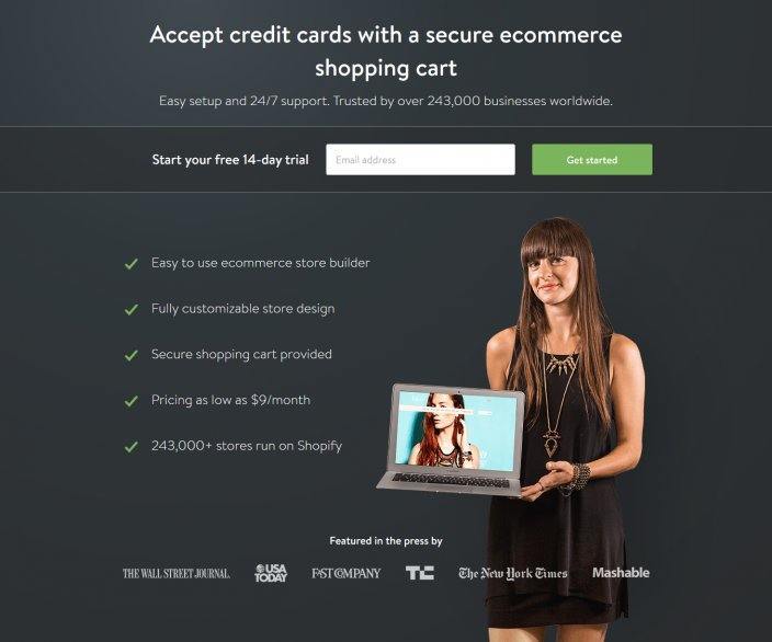
This example landing page by Shopify really steps up on the headline front.
(source)
Their focus is on e-commerce vendors looking to make their shopping carts secure. This page would definitely rank in my top 5 favorite landing page headlines.
CTA Button with a personalized copy
If someone shouts the name of a pedestrian as he/she is walking down the street, they would turn around and take notice. Personalization is similar.
Personalization is the process of connecting with the audiences instantly. You do so by mentioning things they care about.
First names for personalization is a common technique employed in Email Marketing. With landing pages, you will use the benefits of the lead magnet to personalize.
So, out go the boring CTA texts like “Download Now”, “Click Here”, or “Subscribe”. You have to tie the CTA copy to the benefits. So, if your lead magnet is an ebook that helps people increase their traffic, then “Start increasing your traffic today” is better than “Send me the ebook now”.
The second CTA copy here is about the action of getting the ebook, the user will have to think about benefits before he/she clicks that CTA. The first CTA copy is better because it directly shares the benefits without making visitors think about it.
That’s all conversion copywriting is about. You remove the barriers to people realizing the benefits of any product/service you want to sell.
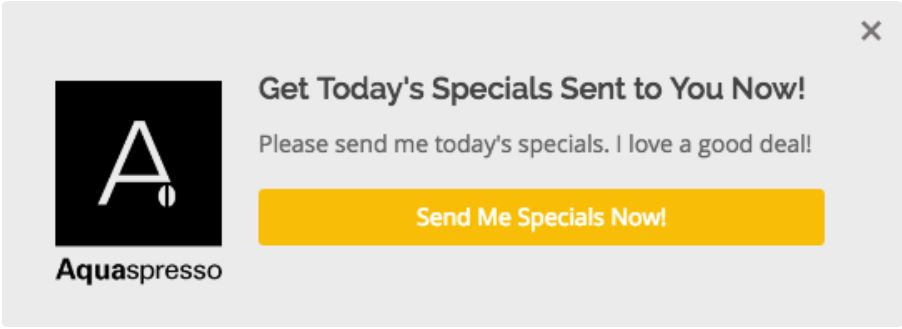
Here is an example of how a good CTA works
(source)
In this example, Aquaspresso is asking users to subscribe to its blog but notice the CTA isn’t the usual boring “Subscribe Now” button. They have personalized it and used the verb “Send” to start the CTA copy.
An optimized lead capture form
We just talked about how a lead capture form can be optimized. You have to place the form according to the length of the page. A number of fields will be dependent on the type of offer or content in the lead magnet. The lower the impact of the lead magnet, lesser are the number of fields are required on the lead capture form.
As a general practice, avoid creating forms with more than 5-7 fields. Use the fields to help leads qualify themselves. If a field has a drop-down box, consider using radio buttons or checkboxes instead.
Keep the form on the right side of the page or as per Z-pattern or F-pattern of design. Finally, as we just discussed, the CTA copy should be focused on the benefits of the lead magnet.
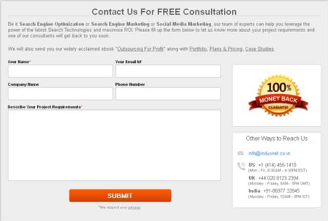
In this example below, the form is asking for a detailed message where the customer will provide details. There’s also a field for a contact number.
(source)
The sales agent can use this message plus the information received on the call to qualify this user for the further sales process.

A conversion-optimized image that is relevant to the lead magnet
The goal for your image is to be relevant and help conversion at the same time. Every type of lead magnet will have a different type of image.
For example, for a lead magnet by a SaaS software company, it makes sense to use a GIF that directly shows how the software works. A GIF may not be fully relevant for an ebook-based lead magnet.
You would also need to connect the image content with the landing page copy. Finding such high-quality stock images which are relevant to the lead magnet and the landing page copy is very, VERY rare.
It’s better to hire a graphic designer who can create these images for your lead capture landing pages.
Your landing page copy needs to be relevant
It goes without saying that you should include benefits of the lead magnet in the copy. Don’t explain features, put yourself in the consumer’s shoes. Explain how their end state after consuming the lead magnet would be different than their current state.
Avoid wordiness and grammatical errors – they’re an instant turnoff.
No need for blocks of text; use short bullet points instead.
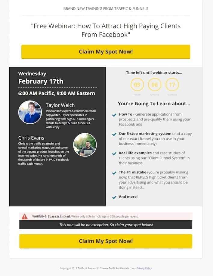
Here’s a good example of landing page copy.
(source)
This page makes the benefits of attending the webinar pretty clear. The profile of speakers here is also impressive and will contribute to conversion. If I am interested in traffic generation strategies, I would definitely want to attend this webinar.
An alternate way of writing landing page copy is to write it like a teaser. In this format, you just use benefits to ask questions instead of simply creating sentences. The idea is to get the people to click the CTA, to make them say “Yes, I want it”.
Social proof with customer testimonials and third-party testimonials
Sometimes, visitors may not fully trust you with the email despite having everything in order – a relevant image, engaging headline with message match and benefits-focused landing page and CTA copy.
They need that extra nudge. Your customer testimonials can do that job.
Third-party testimonials/reviews/badges work to supplement the customer testimonials. They assure the visitors that they are associating themselves with the right company.
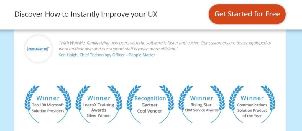
For an example of social proof, we will go back to WalkMe’s landing page.

(source)
Even if I don’t know WalkMe but I am just aware of the awards, this list of awards and the testimonial will make me very impressed. As I scroll down the page, I will also see a ticker with several of WalkMe’s major clients like PayPal and TMobile.
Best Free Lead Magnet Ideas
By now, the concept and importance of lead magnets must have stuck to your mind (pun intended!).
Sure, it’s an artifact we give out for free in exchange for the visitor’s email address.
Sure, it helps us increase the length of our email list.
We also saw how to create a landing page to increase the number of leads captured.
Other than being a reliable and powerful way to build your email list fast, lead magnet accomplishes a few other goals:
It enables conversations with people outside of your marketing funnel
Not all users have the same level of interest. Some are new to your site and may be simply browsing around without giving any serious thought to purchasing something from you.
Your lead magnet is a fantastic way to initiate a conversation that builds trust and authority with these people. After all, who doesn’t like free stuff!
It doesn’t matter if they don’t want to purchase right now. Your email sequences will do the job of maturing the leads to customers.
What matters is getting their contact so that you can talk to them and know when they will be ready to buy.
It helps gather higher quality leads
Who says you can collect only emails with your lead capture forms? You can collect their company information, their role in the company, their location, and so many other unique details to refine their profiles.
Because most forms just ask for email address, your form will stand out by asking a few other relevant details.
These extra fields act as a gate for the visitors to access the lead magnet. Only those who really want it will be willing to give away all the information you ask for.
This is the first level of lead qualification. Those who don’t value your content or have no intention to ever buy from you won’t cross this gate.
If the visitor does cross this gate, you have all the information you need to a) qualify these leads further based on data they consented to submit and b) use this data to personalize your marketing and sales communication.
Now that you know how and when to use lead magnets. Let’s see what type of content you can create that qualifies as a Lead Magnet.
1. E-Books
These are easy to create and distribute. From the visitors’ point of view, they can read e-book PDFs anywhere.
E-book content could be anything that is slightly more detailed than a blog post. It also must provide high value.
Make sure to position the lead for purchase later on in his customer journey. Don’t be afraid to sprinkle a little bit of marketing throughout your e-book, just don’t overdo it. While marketing inside the e-book, focus more on content upgrades and less on driving traffic to your website.
If you focus on the latter, you might end up adding so many links that the user might get annoyed and never read the e-book.
Realize that they want the e-book to read it. If you constantly try to redirect them on to your website with random links peppered throughout the content, you are not allowing them to read. Instead, you may just be forcing them to visit your website – and alienating them from your brand.
2. Quizzes/Tests
Fun quizzes appeal to the curiosity of readers. It’s a very powerful way to invite interaction by leveraging the instant gratification habit which social media inculcates in them.
If someone has reached the end of the quiz, they are invested. Nobody wants to give up at the final step. Their curiosity is heightened by the amount of time it takes to answer the quiz. There’s nothing to stop them from giving an email address; they want to see the results.
3. Cheatsheets
Just as e-books are popular and detailed, cheat sheets are short and actionable. They’re not as short as checklists though. They cover in-depth matter, but their style of writing is a lot more actionable.
They save time and help get things done quickly.
From a content marketing perspective, they are also a great way to redistribute some of the existing content. Your all-inclusive guides can be condensed into cheat sheets as a content repurposing initiative.
When creating a cheat sheet, focus on being straightforward and getting the point across.
4. Coupons
In markets that are sensitive to pricing, you will find coupons are readily consumed. Food and beverage apps, entertainment service providers, FMCG, and travel providers all provide coupons for first-time users.
Coupons also position you ahead of your competitors by granting your brand a sense of exclusivity.
To make the offer even more appealing, simply restrict the time period when it applies. The audiences’ “fear of missing out” takes over and encourages them to share their email address.
5. Free Trials
Products that require large investments upfront also require the end users to get used to it before they can feel comfortable spending money on it. Free trials enable them to get accustomed to your products/services without paying anything.
During this free trial, you should also run an email sequence to help the skeptic users along their decision path. It activates the second line of communication between the brand the lead.
A similar email campaign served after the trial period ends also helps the unconverted leads decide.
6. Webinars
Webinars make delivery and consumption of high-value material interactive. It takes listeners back to school and gives them a feel of a classroom. They are also highly convenient because they are short.
Do you want to appear as an authority in your niche? Conduct a free webinar on the most common problem in your niche. Offer your most effective solution for free and don’t try to sound salesy.
Look to spot the problem for your potential customers and help them solve the problem. You can always offer higher-value products at the end of the webinar, in the last 10 minutes.
Since everyone around the globe may not be able to attend the webinar, offer replays. You can also let them select a different timing to watch a pre-recorded webinar.
7. Mini-courses / Videos
You could offer a free course gated with a lead capture form on a landing page to increase your email list.
These courses are usually delivered over a series of emails. Primarily, videos are shared as course instruction. However, other materials such as quizzes or related blog posts can also be shared.
The online training industry is currently valued at $275 Billion. This makes video courses a very powerful type of lead magnet.
8. Checklists
For many professionals, it’s easier to follow a list to to-dos to execute a task. If your industry has a time-consuming and tedious task, create a checklist to share with your audience.
This checklist contains things they cannot skip while creating the project. For example, after I finish writing the article, I go through a checklist that includes
- Complete read through and edit of the article
- Cleanup of grammatical errors with Grammarly
- Searching and Insertion of Images and their sources
- Internal link insertion
- SEO Keyword Insertion
- Yoast Readability Cleanup
This gives me a smooth editing process that I can repeat every time. I could probably enhance this list a bit before sharing it with other writers so that they can also have a manageable writing process.
Or if I am trying to enhance my email list, I will put this checklist behind a gated opt-in form.
9. Spreadsheets
They are a wonderful tool for project management. They make the lives of managers and employees organized and predictable, taking the guesswork out of daily/weekly/monthly managerial tasks.
However, they are also fairly complex and time-consuming to create for yourself.
Your spreadsheet will make it easy for other managers in your niche by including pre-written complex formulas and color codes. It will work as a template they can use without too much modification.
When users are running out of time, they would search for easy ways to do their task. They find your landing page and see your way of doing things – organized and more professional.
For example, a free basic diet creation spreadsheet with macros calculator can be a great lead magnet for a fitness coach. Anyone who wants to go on a fitness transformation journey can receive the spreadsheet in an email.
10. Planners
Daily planners are great for daily task organization. They affect your leads’ lives in the most direct way.
To create a daily planner, you have to think of “day in the life” of your customers. Find roadblocks and find solutions to ease them. Create simple planners in an editable document, a spreadsheet, or an editable/printable PDF.
11. Calculators
Just like Quizzes, calculators also work by providing external validation. That is not to say customers should not seek them out.
You can help your potential customers put their anxieties at ease by providing calculators, which help them understand their own process and increase their throughput. This way you position yourself as an authority brand in your niche.
Calculators may require math and coding skills. You can always hire someone to create the product for you.
While this may be a time-consuming lead magnet to produce, it works at a psychological level and makes them feel good about their own work. It can grow your email list quite fast if there are no errors.
12. Guides
A lot of stuff on the Internet is useful. A lot of stuff is also unorganized.
By gathering and organizing important and frequently-searched information into a single guide, you can save your visitors a lot of time. They will thank your brand and gladly give you their email address if you do their work for them.
Insert marketing links at the right places inside these guides. Then put them to use as Lead Magnets and see your email list expand faster as these guides are shared with people outside of your marketing funnel.
13. Podcasts
Podcasts are truly useful when you bring multiple experts in your industry together to discuss the most common problem of most users in your niche. The same analysis done on video can also be done on audio.
They provide value and they are usually short and can be consumed casually during the day without planning.
Use them as lead magnets and share audio recordings in the email.
How to write copy to increase conversions for a lead capture page?
Bringing traffic to your landing page for lead capture is just the start. Your Landing Page copy does the real job.
However, writing high-converting copy is as much about understanding customer psychology as it is about actual copy.
Follow these landing page tips to easily create professional landing page copy that’s optimized for conversion.
Use customer feedback directly
Nothing converts like a lead better than existing customers telling them about your product/service. Visitors consider a testimonial as both, personal and trustworthy. The idea here is to make others (who appreciate your product/service) do your bidding for you.
Adding a customer’s picture, their full name, the name of their company, and the designation they serve at in their company – all these details are absolutely essential to make your testimonials genuine.
Without these, your testimonial is simply a block of text written by a stranger. It’s not going to be as effective.
(source)
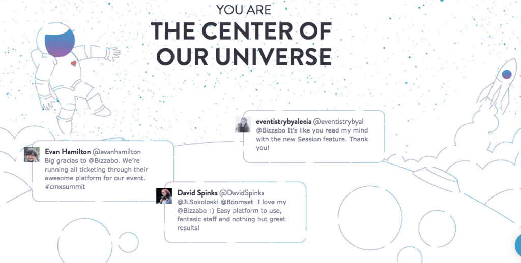
These are direct user testimonials that are accentuated by the awesome headline by the folks at Bizzabo.
Want more awesome examples of testimonials on landing pages? Check out the collection of awesome Customer Testimonial Pages by Margot da Cunha at WordStream.
Stop selling the solution, start selling the benefits
In the modern era of digital marketing, nobody cares about your product or its features. People have gotten so smart that they already know exactly what they want.
This presents a challenge as you have to start thinking about how your product/service helps change the customers’ life. On a lead capture landing page, you will do this exercise for your lead magnet.
Keep focusing on benefits, because everyone in your niche already offers the same (or similar) solution. When you write with the customer in your mind, you are able to orient your copy to them so that they can relate to it.
To really hack your target customer’s psychology, consider hiring a conversion copywriter.
Write a headline that’s truly captivating
Ironically, people don’t read in-depth content when looking for free stuff. They read fast. They skim and they look for keywords, as they often have a decent idea what to look for.
The copy for a landing page that captures new leads, hence, has to be concise.
Focus on the message match between the link to your landing page and the headline on the landing page. When visitors land on your page, they will read the most obvious stuff.
You have to make your headline big, bold, and catchy. Your headline also has to supplemented by an equally-appealing subheadline.
CTA copy and image captions also fall under the skimming radar of most online visitors.
Therefore, when you write your landing page copy, add something about the benefits of your lead magnet into each of these four elements – the headline, the subheadline, image caption, and CTA copy.
Beyond these elements, your actual benefits text MUST include short bullet points. You could still include a block of text, the length of which must not exceed 4 lines (not sentences, lines!).
For multiple paragraphs of text, consider giving them each their own section on the page. The section headline will then be your fifth avenue to communicate benefits.
Use simplicity to your advantage
Yes, you may have great affinity and even major skill in writing fiction. But that’s not what this is about – not by a long shot!
Understand this: your landing page has one and ONLY ONE purpose – to get the customer to download your lead magnet.
It is not a place to test your writing skills or show off your vocabulary or show off your personality.
Yes, personality can sometimes help convert, but that requires the tone to completely resonate with the target market’s preferred tone. You may alienate the visitor if the writer’s personality and the audience’s preferred tone of voice don’t match.
Don’t make “Lord of the Rings” fans feel like they are reading “Harry Potter”, basically!
If you have long, complicated sentences, the resulting wordiness and gobbledygook will be off-putting. You will drive them away. Your conversion rate will suffer. Your leads would likely be bored before they even lay eyes on your CTA. You will feel like you just wasted so much time and effort in creating a landing page that doesn’t even convert.
Instead, keep it simple. Avoid complicated synonyms, use commonly understood words. Employ short sentences, simpler paragraphs, and write with the goal to communicate and sell, not to impress with your writing skills.
Want to test your landing page copy for ease of readability? Show them to your accountant or accounting team. Their job is not to deal with words but with numbers. Of course, many accountants are readers and by extension, they would have a better vocabulary.
Generally speaking, if your accounting team is able to fully understand it, you have done your job in keeping the landing page copy simple.
And while we are at it, you would be better off without these cliched marketing taglines.
Don’t be an alien; sound like a human being
The idea is to not sound robotic. Many writers sound like robots in trying to make their copy simple to understand.
Besides being simple, making your copy conversational allows you to ease the readers. They love talking to humans, so you must sound like a human being.
This includes even breaking a few grammar rules if need be. I find the simplest way to write in a conversational tone is to actually let your MIND talk.
Don’t let your hands and fingers take over; it may happen when you are trying too hard.
Just relax and don’t try too hard. Think about it. Think of how you would sell this lead magnet to your friend (or maybe your special someone). Imagining a human conversation is the easiest way to write content in a conversational tone.
Write to make your content for skimming. Use short sentences. Try medium-length sentences. Make use of long sentences. Mix and match different sentence lengths to take your readers through a rhythm (like I just did!).
And when you have finally written it, do not get conscious about your tone and overthink it. Writing is a recursive function. More or less you will read it with a naturally hyperactive, self-critiquing voice. Don’t listen to it. Avoid making more than one or two rounds of edits on the landing page copy.
Be specific with your numbers, stop giving estimates to your readers.

(source)
Without numbers, you sound bogus. With numbers, you sound reasonable and believable, and most importantly – trustworthy!
A sentence like “This is our most downloaded cheatsheet” sounds somewhat like self-boasting, maybe even boring to some.
Instead, a sentence like “This cheatsheet has helped over 5000 coaches streamline their grading system” works much better. It has a specific number that truly establishes the power of your lead magnet.
It would have been even better had I mentioned the exact number of coaches instead of just saying “over 5000 coaches”. Also, note how I slipped in the major benefit of the lead magnet at the end of that sentence.
Start your CTA with a personalized verb
(source)
Recall your English class in your elementary school when you learned about synonyms.
Remember anything?
Yeah, me neither!
Instead, I use Thesaurus.com whenever I am looking for word alternatives.
The idea behind a personalized CTA is to capture audiences’ sense of wonder. Your CTA needs to have a certain novelty factor to it.
If you use boring words like “Click Here”, “Download Now”, “Email Me Now”, even the most powerful lead magnet can’t save you. To make it personalized, you have to capture the benefits again in the CTA.
To write a good CTA, a) Start with an uncommon, but still easily understandable verb b) inject benefits to your CTA
You might notice that I gave the example of [a] with the word “inject” at the start of [b]. It’s a simple word that everybody knows and understands, but rarely uses it,
To continue with the same example as in the previous step, a CTA like “Send me quick grading cheat sheet” does our job wonderfully. It’s personalized and talks directly about how the customer would want to take action.
Test, measure, observe and improve your landing page copy
Writing conversion copy is not a journey. It doesn’t have an end.
Having said that after testing many changes, you will decide on one variation which gives you the highest conversion rate (i.e. the most lead magnet downloads). And you should keep that variation live.
To reach that variation may not be easy or quick. You have to test different headlines, subheadlines, CTA copy, and your list of benefits.
A/B Testing for Lead Capture Pages
When combined with the right campaign measurement metrics, your lead magnet can generate more downloads and your email address list can grow up to twice as faster (maybe even faster!).
Split (A/B) Testing is the conversion rate enhancement technique that not only gives you good results, but it also delivers them in the way you want it.
See, split testing has no set of rules, only fields which can you vary and test for. So there’s more space for your creativity.
However, while you can experiment in A/B testing, you cannot go for random stuff.
There has to be a structure and a goal behind it – a method to the madness, if you will!
The end goal of split (A/B) testing is to improve conversions.
At this stage, you will polish your page elements to make it the most relatable for your audience.
With that in mind, let’s look at things you can actually customize and test during this phase:
1. Number of form fields
You will need to capture all the most important details with the lead capture form to get self-qualified leads. There is a barrier here too, though.
Getting high-quality leads is also important for your business.
Nobody wants to spend hours or days following up to gather extra information.
If the lead can self-qualify itself, it’s always the preferred option.
Most people filling online forms are not comfortable giving out too many details or spending too much time filling the form.
Your lead magnet is free, they’ll say, then why are you asking for so much information?
It’s a trade-off that A/B testing can easily solve.
It will help you understand how many maximum fields the audience in your niche is comfortable filling.
2. Two-step lead capture form
Your lead capture forms are great candidates for A/B Testing.
A two-step form, as the name suggests, a lead capture form with two different faces – each one having its own copy and own CTA.
After clicking the original (lead capture page) CTA to obtain the lead magnet, visitors see a second form with benefits of the lead magnet which drives them to click on a second CTA.
After clicking the second CTA, the visitor is redirected to an actual lead capture form (i.e. the second face of the form) where their email address and other relevant details may be collected.
Are you thinking right now that this may be counter-intuitive?
It’s not. Read on to figure out why.
Before they click the second CTA, they are forced to be absolutely sure of their decision.
It ensures only willing leads (who truly want your lead magnet) enter your email list.
If they are not sure about handing over their personal information before, single-stage lead capture forms may be a little overwhelming.
These two-stage lead capture forms help relieve their initial jitters, by explaining the benefits once again.
At a later stage, your email marketing metrics will be healthier because they were checked right at the source.
Other elements you should consider running an A/B test:
- Use the word “FREE” on your lead capture forms and/or in your lead capture page copy. Even if your lead magnet is a free one, explicitly saying “free” can only increase conversions. It can’t push potential leads away – who doesn’t want free stuff!
- Use an explainer video alongside your lead capture page copy, instead of an image. Explainer videos can be a great way to reduce lead capture page friction because it uses familiar imagery to explain the offer. This type of video provides information in both text (on video and in the body) and audio information thereby increasing chances of conversion.
- Make the CTA button sticky and make it scroll with the lead capture page. On a long lead capture page, the reader might often be ready to convert before he/she reaches the CTA. If at this midway point, they don’t see a CTA button, they may not scroll up or down again to see the CTA.
- Remove unnecessary fields. This goes in reverse of the principle we explained above when we asked you to test a number of form fields. Most lead magnet forms have email and name fields. If your form asks sensitive information such as “revenue”, it may be preventing the visitor from submitting his/her data. The only way to find out is to run a split test for it.
- Consider offering shortened free-trial periods as lead magnets. If it’s a 30-day free trial, it gives enough time to use your and your competitors’ products/services as well. Having a trial that’s 14-day or 7-day long invokes a sense of urgency for both, trying out your product fully and making a decision to choose your product.
- Provide a time-limited offer on your lead magnet and make it a coveted resource with the help of scarcity marketing.
Concluding Thoughts
A great landing page not only helps you get more leads but also capture more qualified leads. When asking for details in a lead capture form, ask details that help you qualify the leads even before the first contact with them.
There are a lot of amazing free lead magnet ideas to choose from, but e-books and webinars are generally the most popular because they require the least effort to produce. You can use other lead magnet formats mentioned in the article if it’s suits your business niche and/or your audience.
Finally, when writing a landing page copy, your lead magnet’s benefits must be the star of the show. They should be a part of both, your landing page copy and your CTA copy.

