Once in a while, an email lands in your inbox that excites you among the myriad of cliched messages. And we all know it’s the message from your favorite brand. Writing engaging copies is an art that every big name masters these days. 306.4 billion emails are received every day and standing out among them is every marketer’s dream. So how do you create such emails that nail it every time anybody opens them? Email automation has come a long way in giving us some of the best mailing campaign stories. Automating email campaigns is an open secret in the industry as every top brand harnesses its capabilities to strengthen its outreach.
In this article, we will have a look at the top 10 examples of email automation from the top guns. Buckle up to see the email template examples from the best in the business:
Red Bull Sound Select
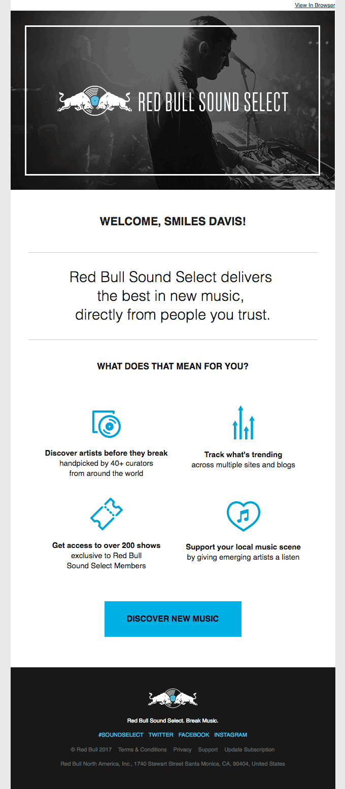
It would be really unfair if we don’t talk about Red Bull while discussing marketing. It has built an empire through its high adrenaline commercials that also sneaks through its mailing efforts. In this exemplar, we have Red Bull inviting folks to its acclaimed “Sound Select” local music initiative. They have placed the image right at the top and all its USPs bank on FOMO and a sense of exclusivity. The recipients get a glimpse into a lifestyle instead of a typical event promo and this is the biggest differentiator in this case. Their CTA “Discover New Music” too allures music enthusiasts into doing what they love: explore fresh, trending artists and experience the next chartbuster way ahead of others.
(Image Source)
Truecaller
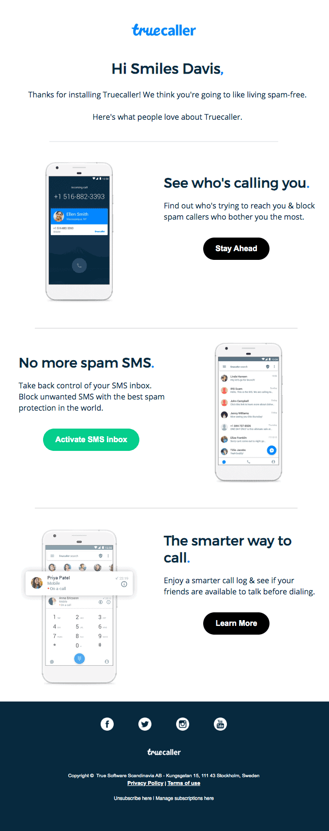
In this automated email from Truecaller, they took the opportunity to thank their users by mentioning their first names and to tell about what people love the most in Truecaller. The email template design is sleek and includes realistic images of using the app functionalities. Everything matches the design language as the copy for each feature and CTA is aligned to give a spam-free experience to their users. All in all, the using bare minimum screen area has paid off as we can focus on every element effortlessly.
(Image Source)
Dollar Shave Club
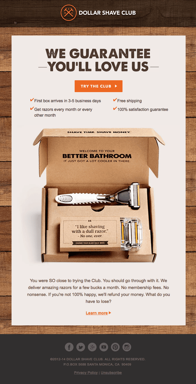
The Dollar Shave Club is consistently making great strides in marketing and it doesn’t shy off when it comes to email campaigns. This automated message meant for customers who abandoned their carts has a few things that can be used by any business. The color consistency throughout the email blends flawlessly with the product. They placed the CTA button right in between the punchline and listed USPs is another smart way to add to the branding game. They have also catered a brief yet effective copy just below the image which is convincing enough to take a second look. All in all, every element reciprocates the persuasive tone and leaves the audience compelled to complete the purchase through its uber aesthetic, effective copy.
(Image Source)
Zapier
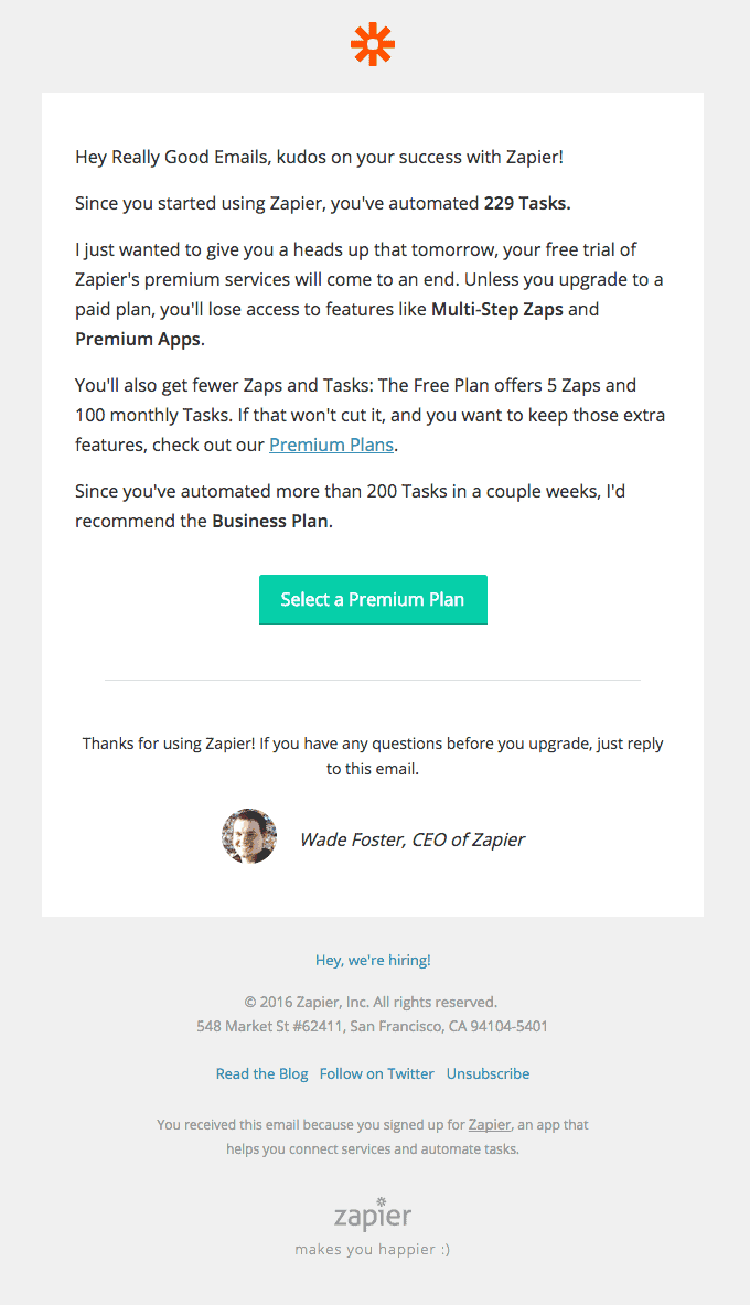
Offering a free trial is a great way of onboarding new customers. But how to tell them that the honeymoon period is about to end and it’s time to get serious? Well, we can do it as Zapier does it here. Instead of starting with “Your free trial period expires tomorrow”, they congratulated the user for successfully automating 229 tasks in this case. Then they gently informed them about the limitations of free plans to convince the user to upgrade to a premium plan. While they have placed a CTA to explore paid plans, they have ended the mail with the CEO personally asking if the user has any doubts regarding the benefits of upgrading. Have a quick look here:
(Image Source)
Starbucks
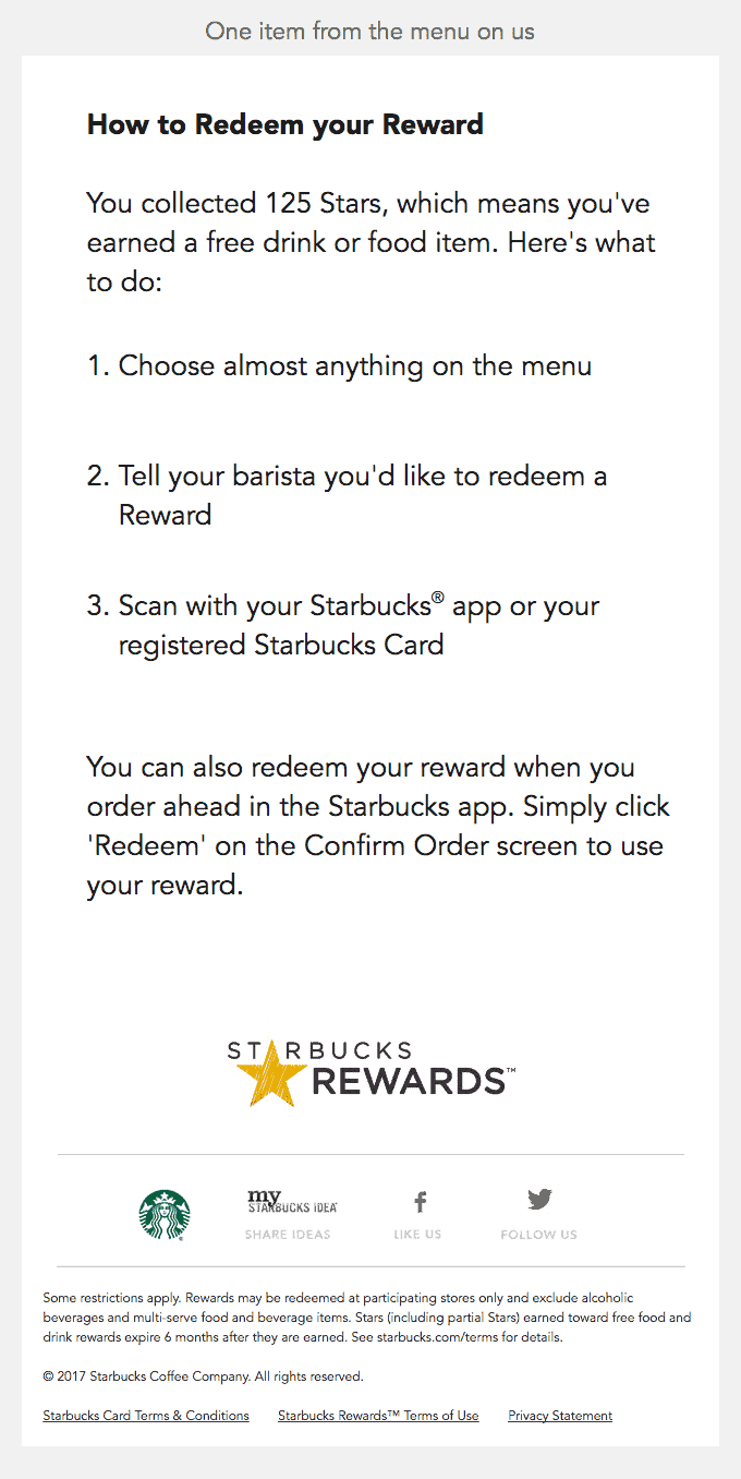
One of the most widely used automated responses for incentivizing engagement is sending loyalty bonuses to your customers. When it comes to driving customer loyalty, Starbucks is second to none. In this emailer from the Cappuccino baron, they have started on a friendly tone by telling that one item’s on their tab. Next, they directly move towards redeeming the rewards and explain the process in three simple steps. It’s simple, inviting, and pretty hard to overlook.
(Image Source)
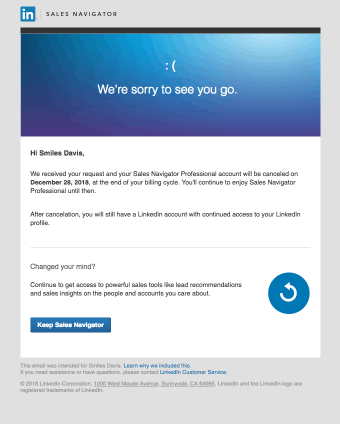
Seeing your paying clients go away is never pleasing to the eyes. This example from LinkedIn has something to learn for every automated retargeting/reactivation/retention campaign– relevance. It has used the well known LinkedIn blue color scheme for establishing instant association but most of the professionals will subconsciously find its smart use of text symbol [ 🙁 ] quite appealing. These professionals hail from the millennial and pre-millennial generations which used them extensively during their yesteryears. They have conveyed the message and left the door open in this concise email.
(Image Source)
Grammarly
Every automation workflow has a spot reserved for email digests and engagement campaigns that they send on a regular basis. If you are planning to do the same, consider using an email template similar to Grammarly’s. It hits the reader at all the right spots as it unravels the metrics every writer seeks in feedback. It gives enough insights for users to read the next email while it also communicates the advantages of upgrading to a premium account.
(Image Source)
Nike
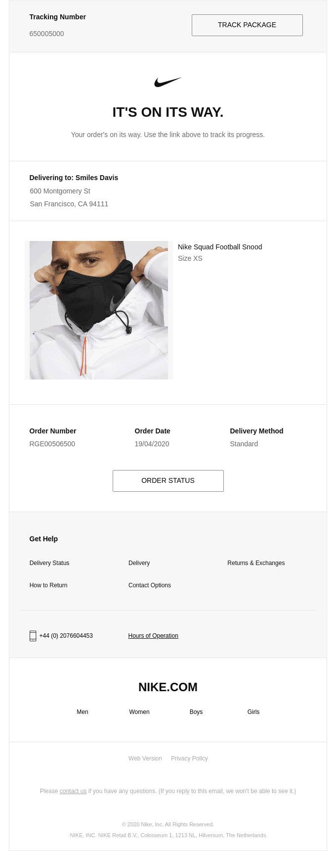
Driving engagement in email marketing is one of the most important tasks and Nike did a wonderful job here. Order confirmation emails often look boring and dull but this one is a piece of art! It looks more like a commercial but it has some functional elements that make this email wonderful at engagement- CTAs for order tracking and status. They have included the product images and description in an advertisement like copy but what I loved the most is their use of Nike logo. The right tick manages to tickle us right as they have fine-tuned the email for customers to feel rewarded even before they receive their jaw-dropping sneakers.
(Image Source)
When it comes to marketing, nobody does it better than Google (pun intended!) This beautiful email catches attention instantly as everybody is into dark UI themes these days. Despite being an email meant for last moment notification for product sale, it does command a second look. Google created a sense of urgency here and the aesthetic appeal complements it perfectly. They went on to use CTAs for listing the product pricing and mention discounts for users for making quick decisions right from there. You can definitely use this automation tactic for all your discounted product sales campaigns for time-bound offers.
(Image Source)
Medium
Medium is arguably one of the best places on the internet when it comes to reading enticing pieces of content on endless subjects. Here is an example of upselling through email automation from Medium that modestly offers monthly subscription with a discounted annual subscription. They have smartly placed the images from top websites and authors to emphasize their strength. Also, exclusive features and an opportunity to patronize the reader’s favorite authors is a wonderful way of letting them feel appreciated. Despite packing a lot of elements, you don’t get the clumsy feel at all. Have a look at their copy and see how it fits in your strategy:
(Image Source)
Read more: 20 Of The Best Product Landing Page Examples Online
Wrapping Up
I have used the illustrations from globally renowned brands to suit our broad audience. All of them are great examples of how brands use automation to nail it every time their subscribers interact with them. But, there is one thing that I would like to add: they are meant to enrich the customer journey through automation. Email marketing automation is as great as the understanding of the customer journey of the person behind the efforts. I hope that you find this list of top 10 examples resourceful and you will benefit from using their learnings right away as you write a stunning copy and create an awesome custom email design for your automation email campaigns.
Author Bio
This is a guest post by Kevin George. Kevin is Head of Marketing at Email Uplers, one of the fastest-growing PSD to Email coding companies, and specializes in crafting professional email templates, custom Mailchimp email templates design and coding in addition to providing email automation, campaign management, and data integration & migration services. He loves gadgets, bikes, jazz, and eats and breathes email marketing. He enjoys sharing his insights and thoughts on email marketing best practices on his blog.

