Digital creators come up with their newsletters for a variety of reasons. Some want to grow their audience base to promote their product or service. Others want to reach out to more people, establish themselves as the industry leader, and grow their personal brands.
No matter your objective, offering a value-packed newsletter to your audience through which they can learn new things and promote your brand is a win-win! But here comes the tricky part – no matter how excellent your newsletter is, you cannot make it successful unless you get many people to subscribe to it.
However, people won’t just hand over their email addresses to you. You will need to give them a solid reason and prove that subscribing to your newsletter will be worth their while.
Have you just started your newsletter? Are you looking for some inspiration and examples to craft the perfect newsletter sign-up forms that can compel your audience to click on the “Subscribe Now” button? If yes, this blog post is for you!
Today, we will share our top 14 email newsletter sign-up form examples that will give you plenty of ideas and inspiration to create a compelling sign-up form yourself.
Let’s dive in!
Table of Contents
1. Investopedia
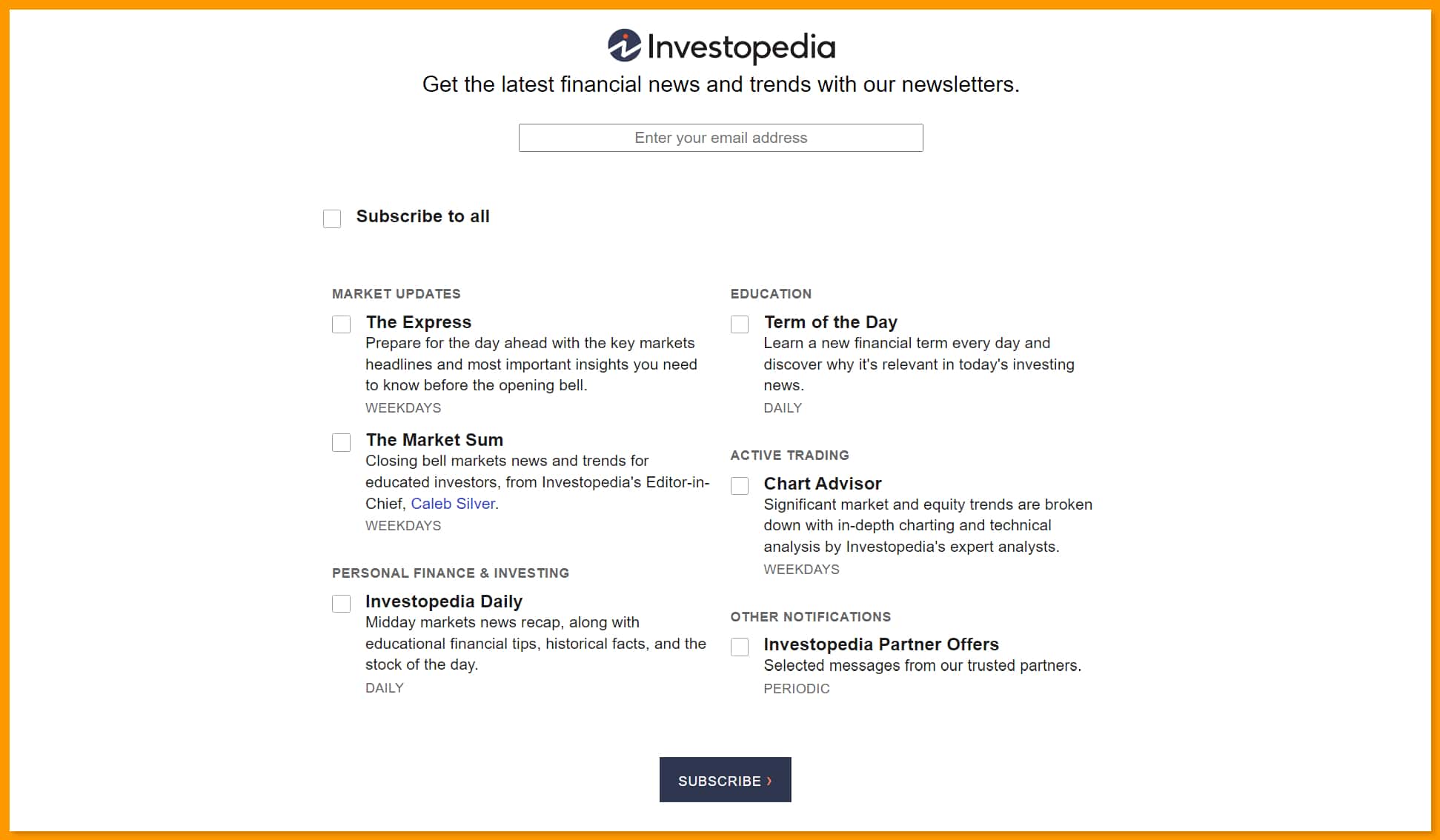
The renowned financial media site, Investopedia has an interesting newsletter sign-up form.
They have a variety of newsletters, and the sign-up form simply highlights the benefits of subscribing to the company’s newsletter along with the frequency of the emails.
Thus, the subscribers know exactly what they are subscribing to and how often they will receive the content.
You can check out Investopedia’s newsletter sign-up example here!
Read also: 10 Fall Newsletter Ideas You’ll Love [+Tips, Examples]
2. PopSugar
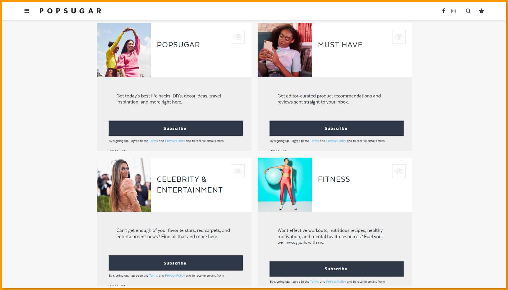
PopSugar has a variety of daily newsletters that users can subscribe to according to their liking. From decor ideas to fitness to celebrity and entertainment news, readers can choose from a large number of topics.
The company’s email subscription page clearly lists all the newsletter options in an attractive way. Thus, viewers can easily find the topics they are most interested in and sign-up for that particular newsletter.
Simple and quick, right?
Check it out here!
Read also: Spring Into Action: Innovative March Newsletter Ideas
3. Kate Spade
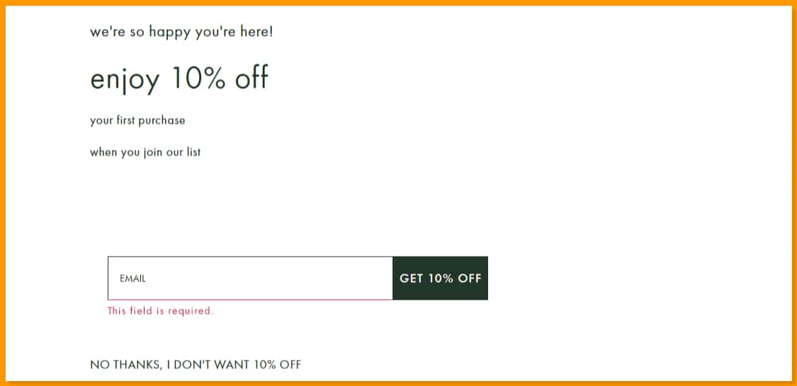
Everyone loves discounts, right? No matter what kind of product we are looking to buy, even a small discount increases our interest in the product and compels us to make a purchase immediately. And the renowned American fashion house knows this!
The company leverages people’s love for discounts by offering them a certain percentage of discounts and free shipping to new email subscribers. Another interesting fact about Kate Spade’s newsletter is its CTA button.
Instead of the usual “Subscribe Now” button, the company uses the CTA – “Get 10% Off.” This reminds the user that they will get an amazing deal on signing up.
Check out their newsletter sign-up form here!
Read also: 18 Amazing April Newsletter Ideas For 2024
4. Hustle Panda
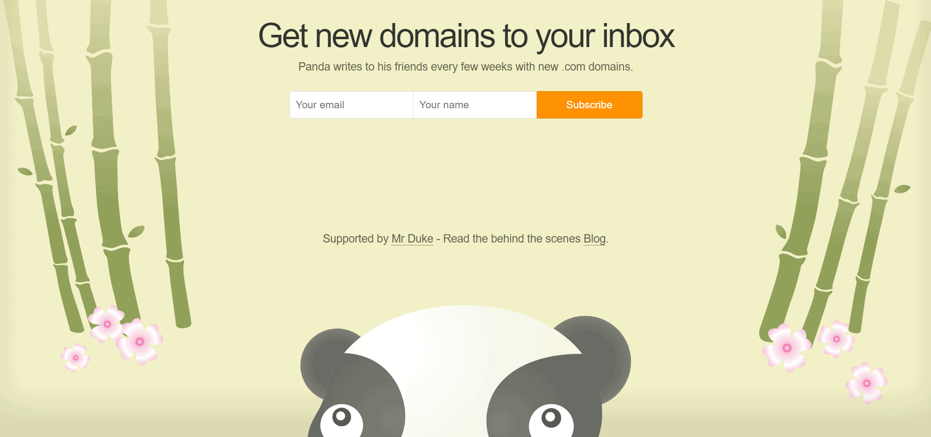
If this were a competition, the award for the cutest email newsletter subscription form would go to Hustle Panda’s email signup!
The company basically helps startups to find the right brandable.com domains for their websites. Through its newsletter, the company shares new domains with its subscribers every once in a while.
We absolutely loved the adorable graphics they used in their subscription form. They use a simple but clear line: “Get new domains to your inbox.”
The email subscribers know exactly what they will get after signing up.
It’s clear, precise, and attractive too! Check it out here.
The Best Time To Send an Email (and the Worst)
5. Copyhackers
Copyhackers is a well-known website focused on copywriting. So, its newsletter sign-up form displays the strength of a good copy. Its newsletter sign-up form is simple but conveys all the necessary information with solid social proof.
The company’s newsletter says – “Join 49,000+ fine folk. Stay as long as you’d like.”
This accomplishes two things:
- It shows the readers that there are a large number of people who already trust Copyhackers and have subscribed to their newsletter
- It clarifies that they can unsubscribe anytime. This gives the power into the hands of the readers.
Copyhacker’s newsletter sign-up form is strategically placed at the bottom of their website. Go to the website and scroll down to check it out.
Read also: 2024 Done Right: Creative January Newsletter Ideas
6. Solo Stove
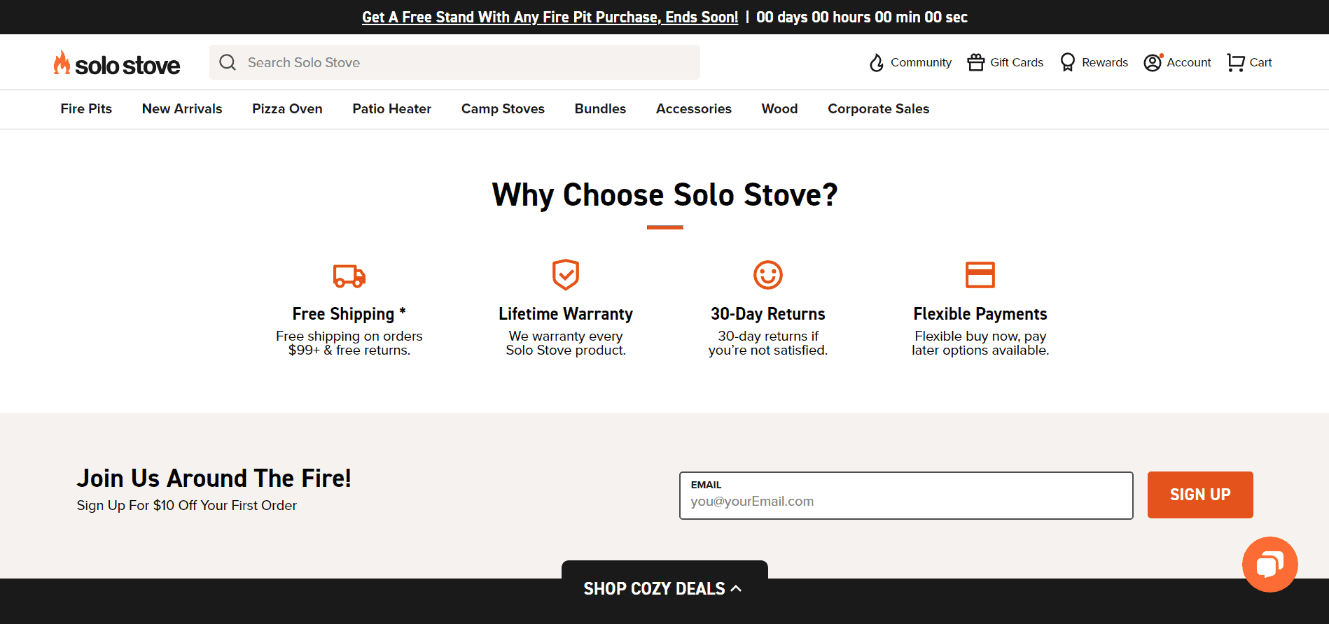
Solo Stove also has a solid newsletter sign-up form. The company believes in attracting its audience with the help of lucrative incentives. It offers all email subscribers a flat $10 off on their first purchase.
Another praiseworthy thing about Solo Stove’s newsletter sign-up form is its placement. The company has placed its email sign-up form at the bottom of the landing page. So, the viewers will get to it after seeing the products. This encourages them further to subscribe to the email list.
Scroll down to the bottom of Solo Stove’s homepage to see their simple but super-effective email sign-up form.
Read also: 23 Creative May Newsletter Ideas to Celebrate the Vibrancy of Spring
7. Skagen
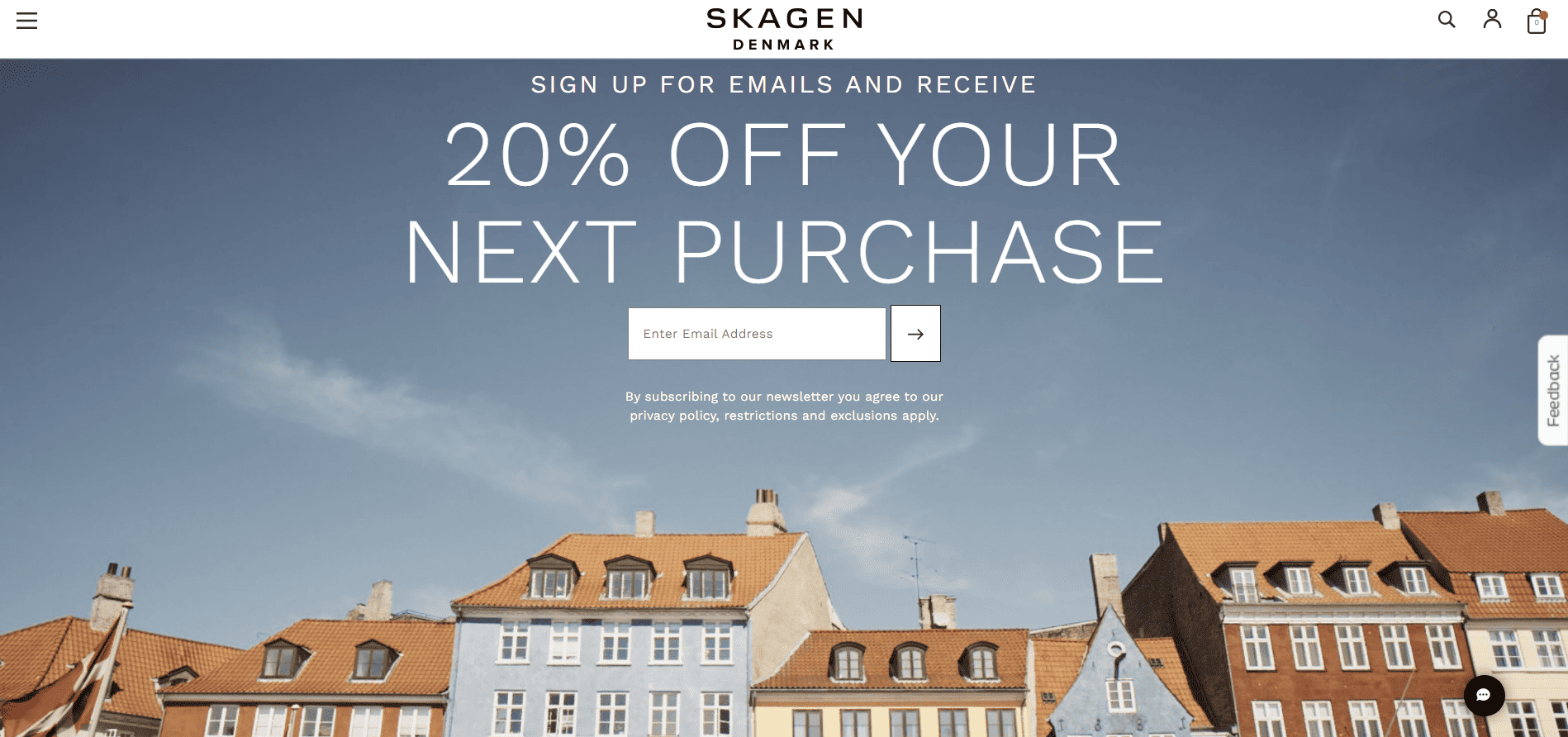
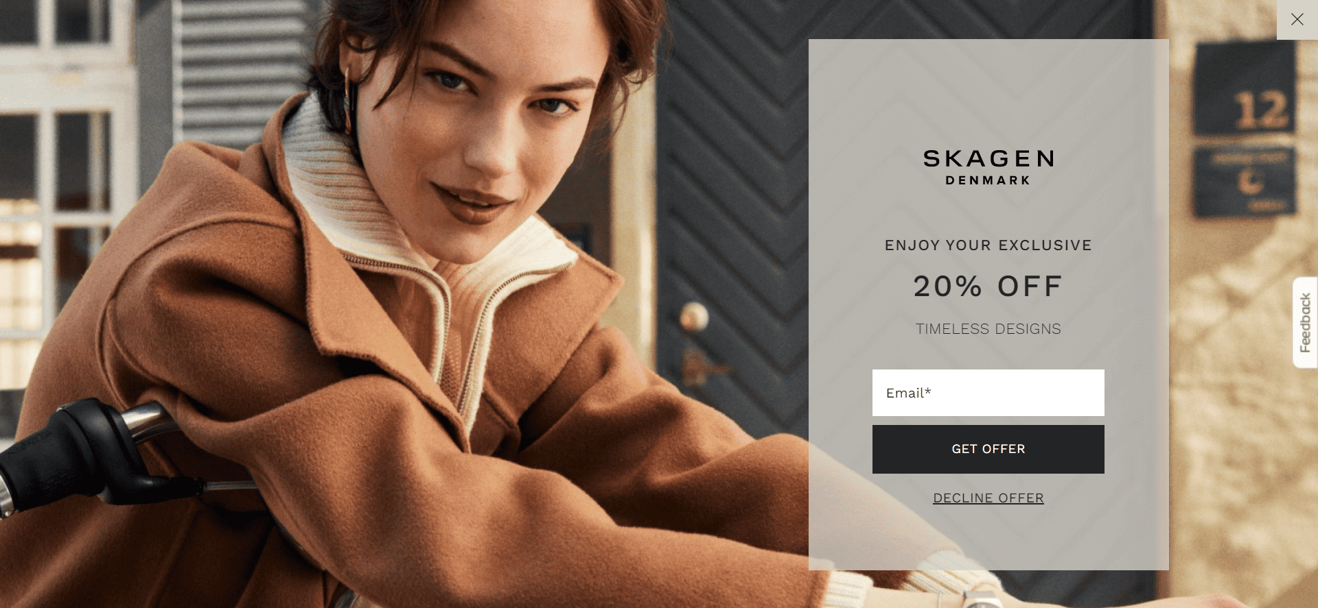
The luxury watch brand, Skagen, has several different creatives for its email sign-up form. On its website, the company offers a discount of 20% on its timeless designs if you sign up for its emails.
Based on your activity, you’ll see other popup forms that also have a similar message, like the one below 👇🏻
Check out Skagen’s email sign-up form here.
8. Demand Curve
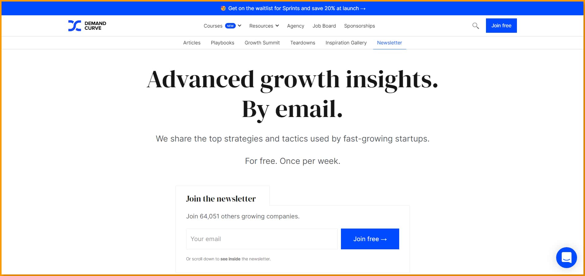
Demand Curve decided not to beat around the bush with its newsletter sign-up form. It clearly mentions the amazing benefits the users will get after signing up for the newsletter.
Demand Curve promises to send top strategies and tactics successful startups use to their email subscribers once a week through its value-packed weekly newsletter.
At the end of its subscription form, Deman Curve strategically mentions that it is trusted by over 64,000 founders and marketers.
Thus, Demand Curve’s form has two excellent elements:
- An exciting and useful offer
- A solid social proof
Check it out here!
Email Blast Examples From Popular Brands to Inspire You
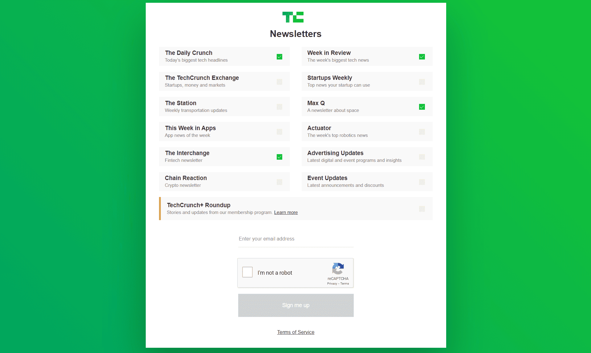
9. Tech Crunch
Another fabulous newsletter sign-up example is that of Tech Crunch.
What is unique about this company’s newsletter is that they respect their users’ time and give them the power to choose their newsletter.
Tech Crunch has a variety of newsletters. For example, they have separate newsletters about space, money, markets, startups, etc.
The company allows people to choose the ones that they want to receive in their inboxes. In this way, users will only receive newsletters they are interested in, and their inboxes will be clear with everything unwanted.
Check out Tech Crunch’s newsletter example here!
Read also: Engaging February Newsletter Ideas Beyond Valentine’s Day
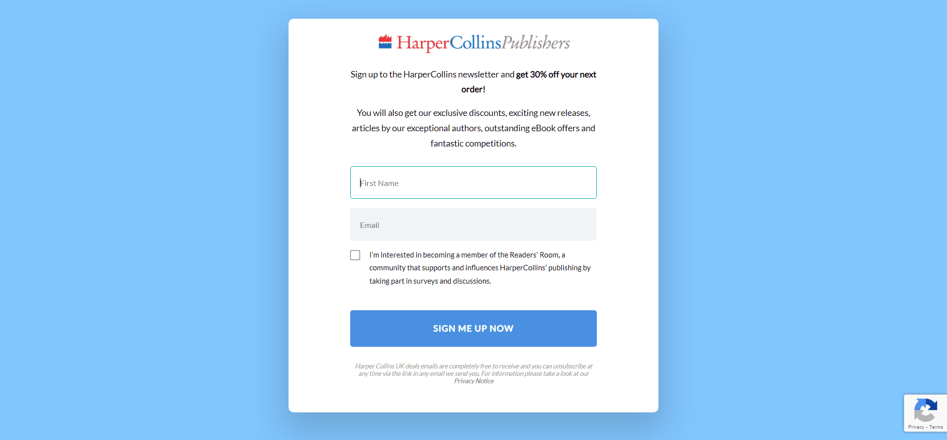
10. HarperCollins UK
The popular book publisher, HarperCollins UK, also has an excellent newsletter sign-up form. The company offers a whopping 30% off on the user’s entire order if they sign-up for its newsletter.
Not only this, but HarperCollins UK also entices users by revealing that its newsletter will offer them additional benefits.
It includes exclusive deals, personalized content on the books they love (which is every book lover’s dream!), and more benefits.
Check out the HarperCollins UK sign-up form here!
Read also: The Best Time To Send an Email (and the Worst)
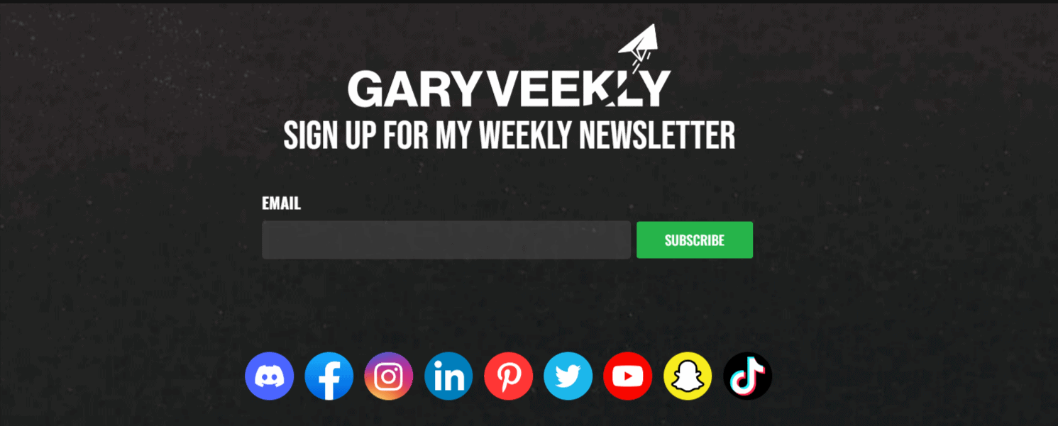
11. Gary Vaynerchuk
Gary Vaynerchuk has a minimalistic email sign-up form that doesn’t try too hard to stand out, making it unique.
The form is super simple and states, “Sign-up for my weekly newsletter.” It helps that the website is also minimalistic but power-packed with awesome copywriting.
You can scroll down to the bottom of his website’s home page, and you will be able to see the newsletter sign-up form there.
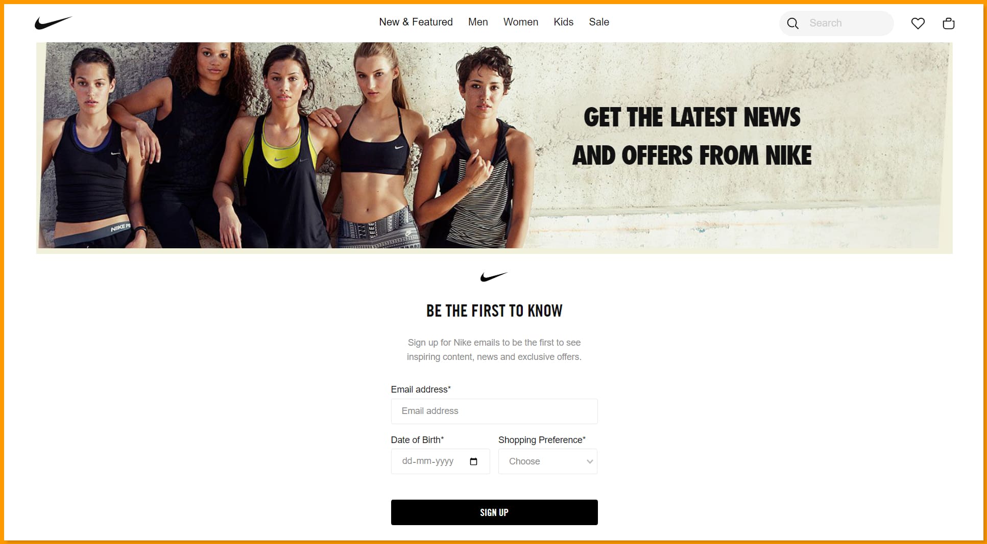
12. Nike
Being the world’s largest supplier of sportswear – both shoes and apparel – Nike knows how to impress its audience and leave them wanting more.
The Newsletter sign-up form of Nike is simple but crafted super intelligently. The form has an email address input field, a Date of Birth field, and a Shopping Preference field (Men or Women). This allows Nike to collect super-specific data and targeted leads that it can use to create more personalized emails.
The best thing about Nike’s email sign-up form is that the user only has to fill in the email address field by typing. For the rest of the details, there are drop-down menus.
This helps Nike collect important information without having the users type in many things.
Check out Nike’s newsletter sign-up form here!
Read also: Holiday Newsletter Ideas & Examples From Top Brands
13. National Geographic
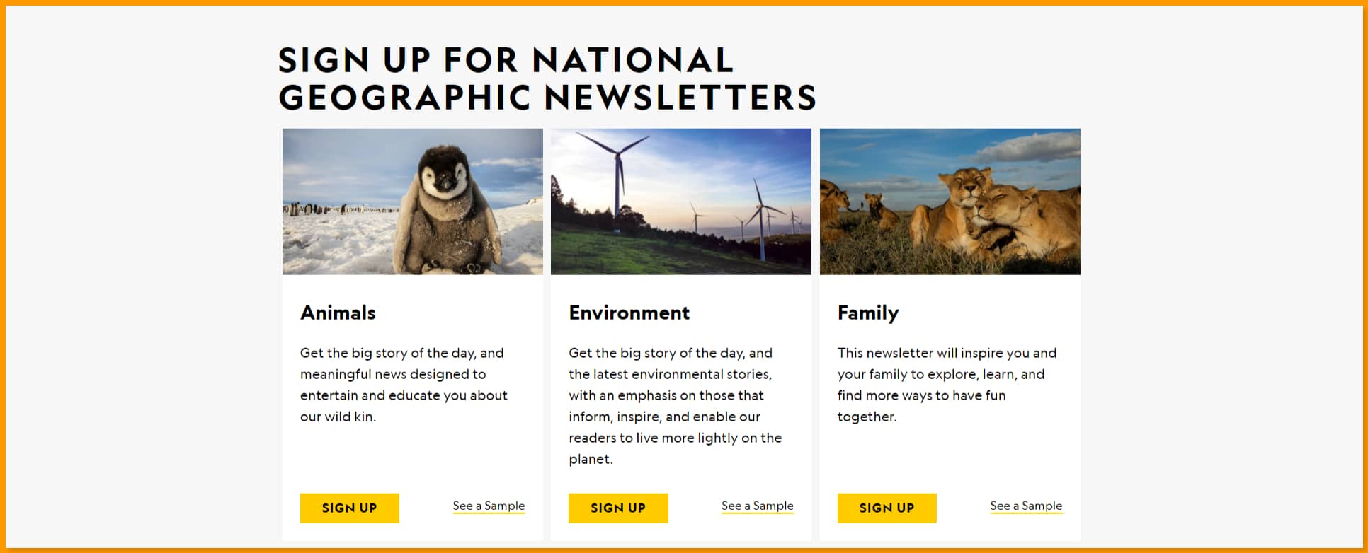
The incredibly popular American monthly magazine became a household name with its science and wildlife-based television channel. The company also has a large number of exciting newsletters that its readers and viewers can subscribe to.
The best thing about National Geographic’s newsletters is that it covers multiple topics. From animals to history to health, there are many newsletters that people can subscribe to and enjoy.
The company uses a simple email sign-up form that clearly mentions what each newsletter will deliver. What we like the most about National Geographic is that it allows people to see a sample of all its newsletters so that people can know what they are signing up for.
You can check it out here!
14. VOX Newsletter
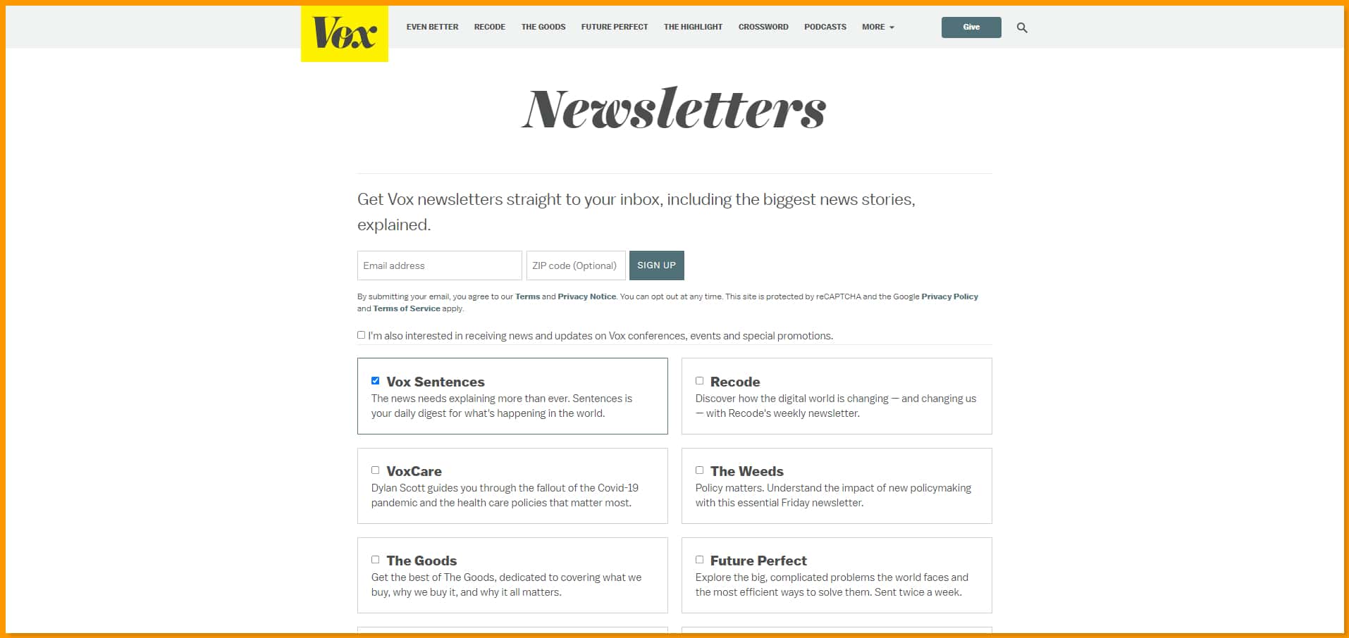
Finally, we have Vox’s newsletter. This popular news and general interest website offer excellent content through its newsletters. Just like National Geographic, Vox also offers multiple newsletters. It allows its audience to sign up for the ones they are most interested in.
Along with listing its variety of newsletters, Vox also tells people what they will get after subscribing. The company promises to explain the biggest news stories in its newsletters interestingly.
You can check out Vox’s newsletter sign-up form example here!
How to Create Great Email Newsletters [With 7 Free Templates]
Summing Up
We hope that you liked some of these newsletter signup form examples.
If we missed out on any nice ones, mention them in the comments.
Also, check out EngageBay to make your signup forms and do a whole lot else in marketing.

