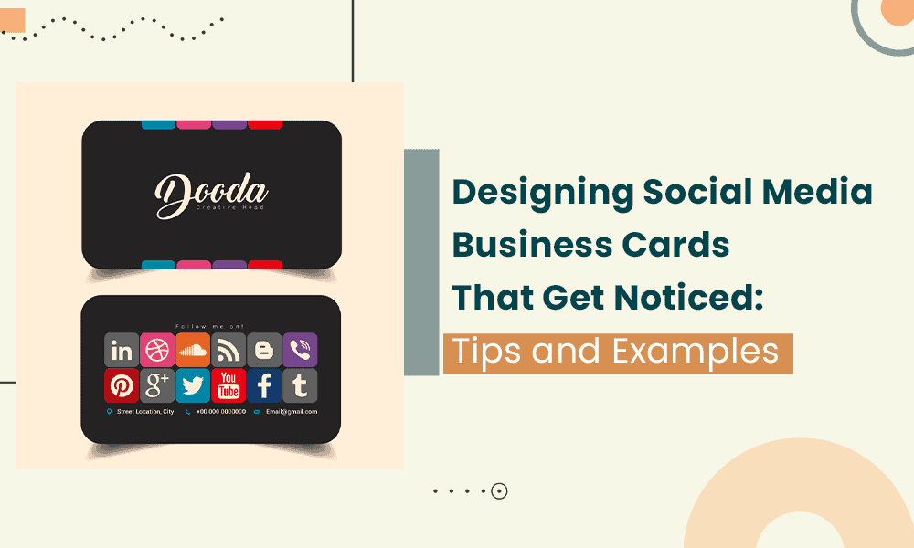
With the way digital media has replaced physical media in so many ways, you might have assumed that business cards had gone the way of the dodo.
Not quite! Business cards still exist, but their purposes have changed.
Rather than only a physical address, phone number, and fax number like in the good, ol’ days, business cards today include all the ways to reach out, such as social media handles.
In fact, these business cards even have a name – social media business cards.
Every professional should have a stack of social media business cards ready to hand out during networking and media events. You never know what kinds of opportunities could arise!
If you’re eager to learn more about this business card style, including how to make your own, you can’t miss this guide. We have so much great information to come, so keep reading!
Table of Contents
What Are Social Media Business Cards?
You feel out of the loop. What in the world is a social media business card?
As we alluded to in the intro, a social media business card doesn’t differ all that much from your standard business card except for its content.
The focus of the card is showcasing all your social media handles, from Facebook to Instagram, Twitter, YouTube, Pinterest, and more.
Putting the handles in one convenient location makes it easy for any business card recipient to follow you and stay up-to-date on all your professional endeavors, whether as part of a business or as an individual.
People still largely expect the same tired business card format, so handing them a social media business card will generate some buzz.
If you attend a networking or media event and someone comes away from that event with a thick stack of business cards, the social media elements of your card will help you stand out.
Stunning Content: 10 Top Free and Paid Social Media Video Creator Apps
8 Can’t-Miss Elements of a Social Media Business Card (With Examples!)
You had never realized that social media business cards existed. Now that you know, you’re eager to print up some of your own.
What kinds of elements does your business card need? That’s the fun part – you have the freedom to customize the contents of the card to your liking and personal tastes.
This section will highlight social media business card designs with real examples so you can see some effective elements at play.
1. QR Codes
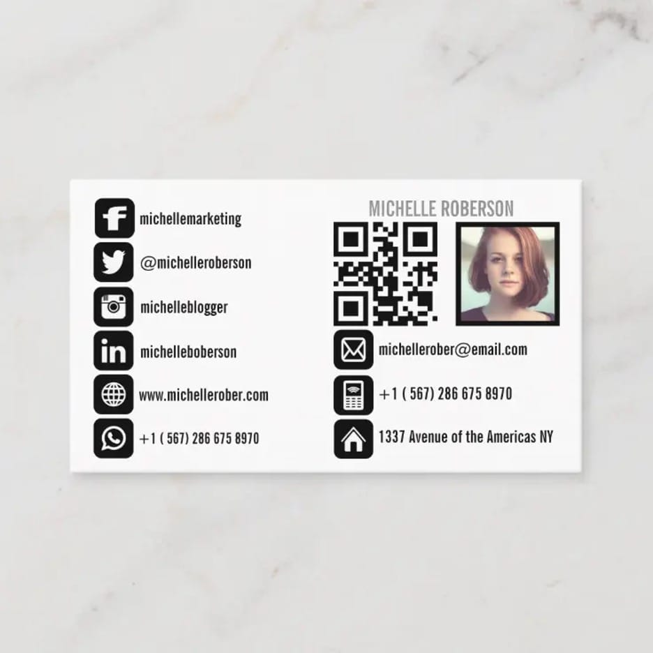
QR technology is so cool, wouldn’t you say? All you have to do is hold up your smartphone to the QR code. Your phone reads the code and then transfers you to the appropriate website without you having to type a thing.
You don’t even need a specific phone app to do it, just your phone camera. That makes QR code scanning accessible to everyone.
QR codes will always look more appealing than hyperlinks, and it’s not like you can include a hyperlink on a business card anyway, so you should strongly consider making a QR code to add to your own card!
From Social Media to Events: 19 Proven Childcare Marketing Ideas
2. Logos
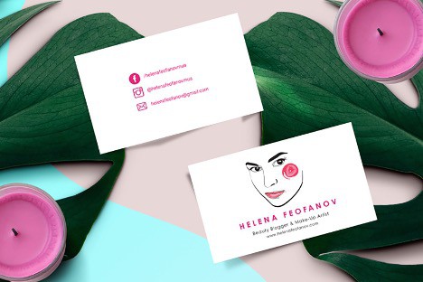
Whether you’re an entrepreneur or part of a business, you worked hard to create your logo. It’s a unique part of you, just like your social media handles, so why not spotlight it on your business card?
In the case of the example above, the blogger chose to showcase their logo on the entire front of the card and then feature their social media handles on the back.
That’s certainly one way to do it. You have to consider, though, that not everyone will necessarily flip to the back of the card.
Even if they only looked at the front of the card in this example, it has a great design and the blogger’s website URL, but it’s not technically a social media business card since all the social information is on the flip side.
Always put your social media handles front and center to ensure they’re not missed.
If you do not have a logo to feature yet, you can try a DIY logo maker or participate in a logo contest to get a custom design.
How to Easily Prioritize Your Social Media Marketing Goals
3. Color
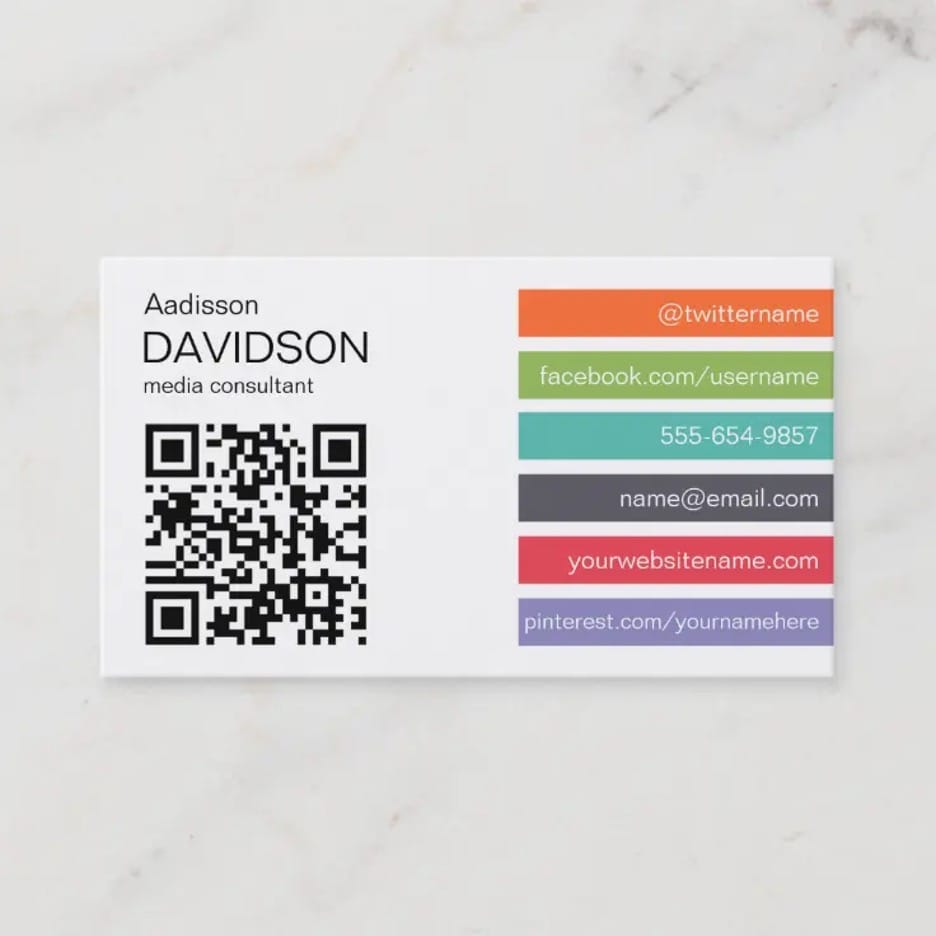
Although this social media business card is only a sample, it shows how effectively color works, especially when accompanied by an otherwise simple design.
The use of individual colors creates a nice rainbow effect that naturally draws the eye toward one’s social media handles. The colors also separate each element on the card.
This way, if your contact only wants your Facebook or Twitter handle, it’s easier to find those because they’re color-coded, if you will.
You don’t have to incorporate colors into your social media business card exactly like this, of course. If you have a colorful logo, it will look that much more appealing against a simple, single-colored card.
Fun Social Media Engagement Posts: 6 Great Ideas
4. Easy to Read
A business card can only be so large, which can cause you to cram too much information onto it, especially if you want to include your laundry list of social media handles. Then it’s difficult for the recipient to read it.
If they mistype one of your social media handles because they can’t tell if that’s a lowercase L or an uppercase I, they’ll get your name wrong and might not be able to find you online.
A social media business card design like this one eradicates that issue. There’s enough space between each social media handle that nothing feels cramped.
Further, this business card design uses large, legible font so someone can easily type in your handle URL on their computer or smartphone without difficulty.
40 Social Media Marketing Quotes
5. Recyclable
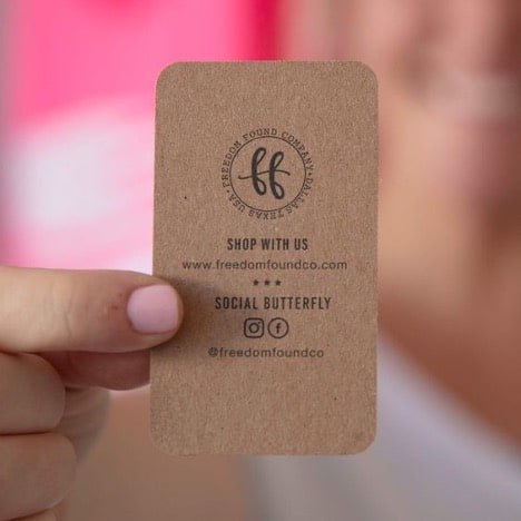
These days, people care more than ever about where their products come from and where they go after use. A recyclable social media business card is a great green decision you can feel good about.
The recipients who get your card will appreciate your dedication to keeping our earth habitable. As a nice bonus, the recycled paper design of your card will make it more unique.
We also like the design of this business card for another reason. The FreedomFoundCo store uses the same handle on Facebook and Instagram, and they found a great way to condense that information.
Rather than use two areas on this small business card to separate their Facebook and Instagram presence, the company wisely includes the logos for the two social media channels together with one handle.
It’s a handy, concise design tactic you might consider for your social media business card design.
Creating The Perfect Social Media Handle For Your Business
6. Unique Design
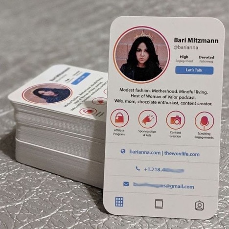
What constitutes a unique design for a social media business card? That’s something that’s entirely up to you, but we quite like the look of this social media card from Bari Mitzmann.
Mitzmann had the ingenious idea to design a business card resembling an Instagram profile. She has a bio, some of her services as highlights, and her contact information lower on the card.
If you hand out a card with such a compelling design as this at an event, you can bet the card will garner a lot of attention.
Instagram For Small Business: 10 Not-So-Obvious Tactics
7. Transparent
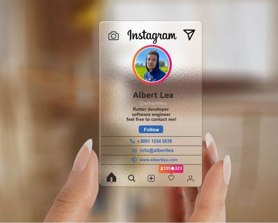
Although not as eco-friendly as recyclable business cards, we can’t deny the impact that plastic business cards make, especially transparent plastic cards.
For one, they just feel different. It feels more like a credit card, and the additional weight of the card lends it more professionalism, we think.
Unlike a paper business card, which can get creased and bent in one’s pocket, a plastic card holds up better.
Transparent plastic also grabs attention. That’s the example in the image above, but it has a different format since it’s on a translucent plastic card.
What is Social Selling? Benefits, Examples, Strategy, and Index
8. Unique Shape
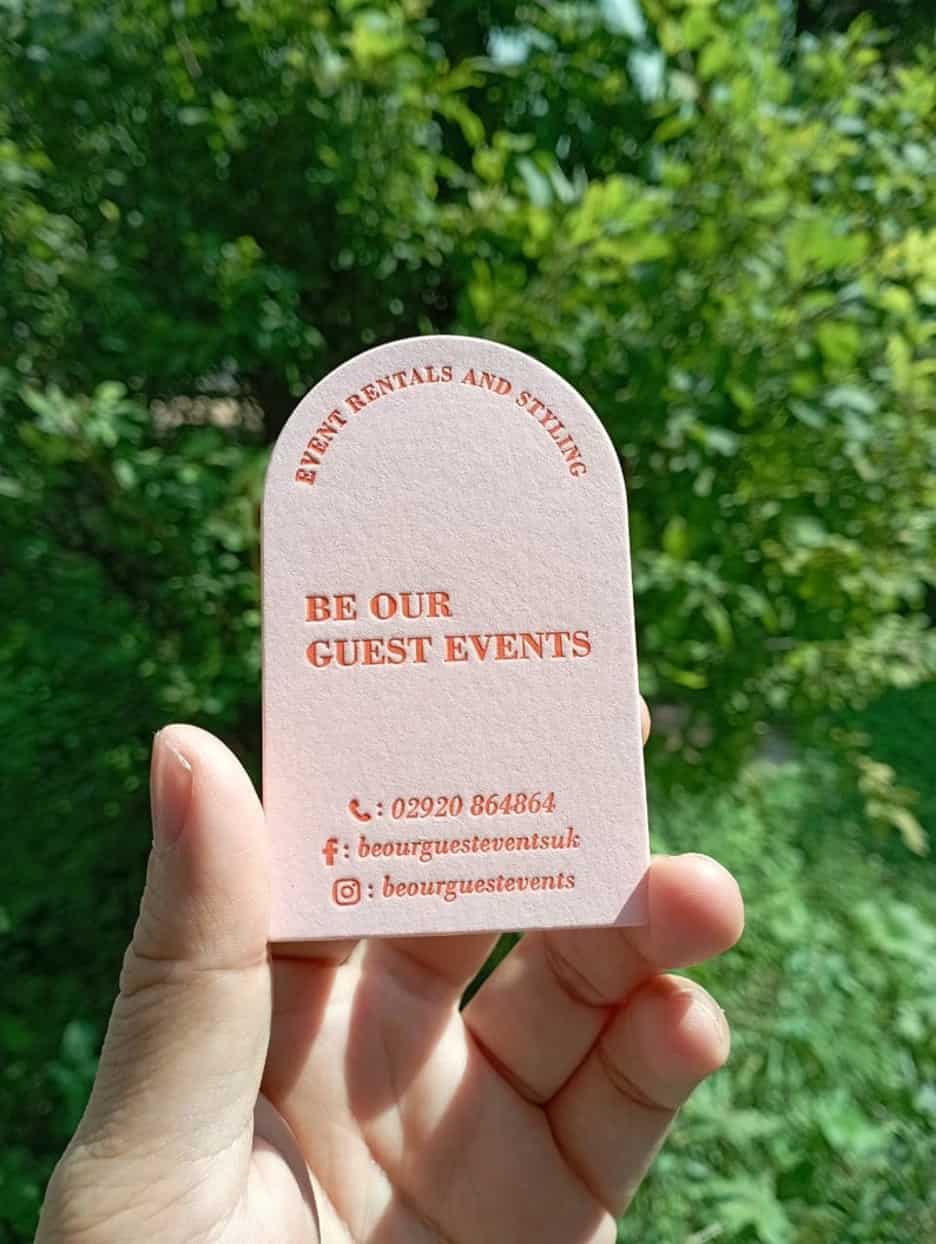
Business cards have existed since the 17th century. Here we are, living in the 21st century, and we’re still printing our business cards on rectangular cardstock.
Why do that when you can use an arched business card design instead? Sure, it costs more to print this type of card, and you may have less space on the card depending on how you orient your design, but the special shape turns heads.
You can use the top of the arch on the card to orient your text as seen in the example above, and then include the rest of your socials elsewhere.
Don’t hand out rectangular cards like everyone else at your next media or networking event; try something different!
Interview with Neil Schaffer, Leading Social Media Speaker
How to Add Social Media Icons to Your Business Card
Have you always wondered how all these social media business card designers get the social media icons they use? Or how to add them to your own business cards? We’ve got you covered in this section!
Sourcing Business Card Social Media Icons
Social media icons like the Twitter bird or the Facebook F are instantly recognizable. When selecting a source for your social media icons, don’t settle for less than authentic logos.
If you use inauthentic logos that don’t meet brand book standards, you could come across as unprofessional and turn off potential contacts who receive your social media business card.
Don’t change up the designs of the originals too much. While you can change the colors of a social media icon to match your business card design, don’t rotate the brand icons or add other elements to them.
To find free icons for your business card, check out websites like Icons8, Find Icons, Ego Icons, or Freepik.
Adding Business Card Social Media Icons
Now that you’ve found your icons, you need to put them on your business card mockup.
You don’t necessarily need heavy-hitting graphics design programs like Adobe Illustrator or Photoshop. You can use a free graphic designer or tools like Microsoft Word to assemble your business card.
If it’s easier and you have the budget, you can also hand the design responsibilities off to a professional.
One Simple Guide For the Best Time to Post Reels on Instagram
Social Media Business Card Design Best Practices
Are you ready to create your very own social media business card? Here are some design best practices you won’t want to miss.
Use White Space to Your Advantage
A cluttered business card can overwhelm the recipient. It’s like information overload.
It’s okay to have white space on your social media business card. If anything, it’s a good thing, as the presence of white space indicates that you haven’t overcomplicated your design.
Keep the Size of the Icons the Same
Whether we’re talking only social media icons or social media icons with email and website icons, the size must stay uniform. That’s just a good design practice!
Organize Your Social Icons by Followers or Most-Used
Suppose you use Facebook more than any other social media platform, but you put your Facebook handle last on your business card. Can you really complain when you then get the fewest Facebook followers?
Prioritizing the order of your social icons tells your business card recipient which social media platform to follow you on first.
One organization method is to sort the icons from the most to the least used. You can even categorize them by your number of followers!
Don’t Cram in Too Many Icons
To avoid making your business card design an eyesore, don’t add too many social media icons and handles.
The rule of thumb is to choose three. If you want more than three social media handles, ditch the icons and present the handles in a different format.
Emojis in Social Media Marketing: Some Useful Tips
Conclusion
Social media business cards can increase your social following whenever you attend a media or networking event.
You have to expect that your competitors will also hand out social media business cards, so a good design matters.
You might change the shape of your business card or the material (such as plastic or recycled paper). You should also embrace colorful, unique designs.
Above all else, your business card should be easy to read, have plenty of white space, and prioritize the social media pages.
Good luck!
👉Discover the most creative bio ideas that will captivate your audience in our detailed article! 📝

