But it can be tricky to design one for yourself, especially if you’re starting out.
In today’s article, we’ll feature email blast campaigns from popular brands across various industries. We’ll analyze how they use email marketing to drive web traffic, increase engagement and sales, and build a loyal customer base.
Table of Contents
What Is an Email Blast?
An email blast is a mass email campaign where you send an email to thousands of your customers in one shot.
For example, Black Friday is about to come, and you must inform all the customers in your email list about your holiday deals. Now, you can’t email everyone on your list individually; this is where businesses use a promotional email blast using a good email marketing tool.
Best Email Blast Examples to Inspire Your Email Marketing Campaign
Let’s look at examples from the best brands.
Nike
Nike is known for its exhilarating shoes, and its email design vouches for them.
Why it works
Headline
One first notices the headline: Nike did a great job. Announcing that you’ll offer ‘free shipping’ is a smart way to encourage purchases.
Email body
Images cover almost 90% of the email; it looks like Nike takes the ‘Picture speaks more than a thousand words’ idiom seriously. Nearly every new product announcement by Nike has the same email template.
They’ve used attention-grabbing images and a short copy of the new shoe. Nike shoes always have a theme behind them, and it looks like Nike Zoom Air Pegasus 38 helps runners ‘fly easily.’ It does make us curious.
But the background image of athletes running with the new shoe is the best. User-generated content marketing is the best way to show social proof and trigger a customer to purchase.
CTA
Nike knows its popularity, and word of mouth is a major selling factor behind the brand. Also, it looks like they know that a simple call-to-action — ‘Shop’ — will get their loyal customers going: the pinnacle of brand awareness.
Email Blast – 9 Ways to Get Positive Results [Updated]
Invision
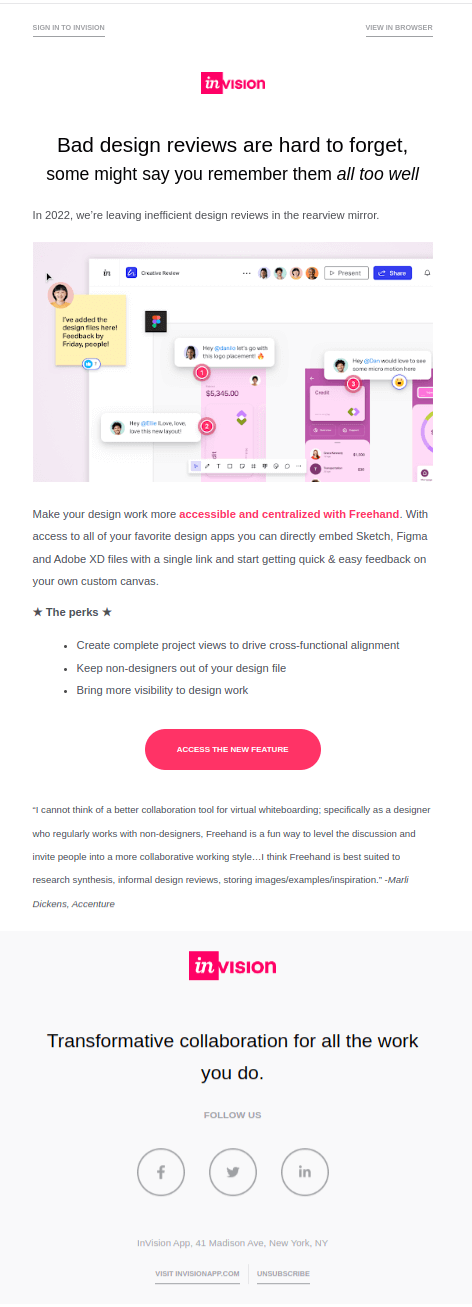
Their new feature announcement email blast campaign has a minimalistic design for a design platform. But this is not surprising; most of their emails have a minimal visual element accompanied by fun, informative content.
Why it works
Headline
The antagonist for graphic designers is the non-detailed reviews. Designers hate them, and the headline addresses it directly and sets the narrative for the email. Headlines should show and not tell what the feature is about, and Invision has done it brilliantly, making this a great email marketing example.
Email body
Unlike Nike, Invision doesn’t cover 80% of its email body with images. Both visual elements and contents are equally balanced. And the image addresses the pain points (reviews) very well.
It starts with, “In 2022, we’re leaving inefficient design reviews in the rearview mirror.” A forward-thinking statement that shows something new is coming.
The image and the text play well together in explaining the new feature clearly. The usage of a customer testimonial from a high-profile leader increases credibility.
Not once was the name of the feature announced in the email, but email subscribers can understand what it does (show, don’t tell).
CTA
An eye-catching CTA to grab attention and an actionable word to influence a click — Invision nailed it!
Read also: 15 Introduction Email Templates That Work Like A Charm
Canva
Here’s another email blast from a design platform. Keeping customers engaged is essential; it boosts customer lifetime value. And Canva used the right occasion to keep customers engaged: Halloween.

Why it works
Headline
The headline is time-sensitive and grabs attention, acting as a welcome email for the event. It was sent on October 27, 2022, two days before Halloween. A ‘Zombie-themed’ challenge reflects the occasion pretty well. Who wouldn’t enroll in it?
Email body
The email content is divided into three sections and is equally balanced between visuals and text.
Without sugarcoating, they went on to explain the whole shebang right away. It tells what the challenge is and what needs to be done to win a Canva prize pack.
The next section tells the readers how to enter the presentation contest. It is brilliantly done as it saves time for the users, and they can start their design immediately. They’ve also added an image as a visual guide for the readers.
Canva might’ve thought, What if people don’t participate in it? Let’s spice up the email.
So, they added user-generated presentations in the third section and featured the best designs to trigger action from email recipients — a great email marketing strategy to convert a potential customer.
CTA
They designed a CTA with an actionable word and a bright color to make it stand out. Note that they added the CTA multiple times.
Email Automation Basics, Tips, and Examples
Etsy
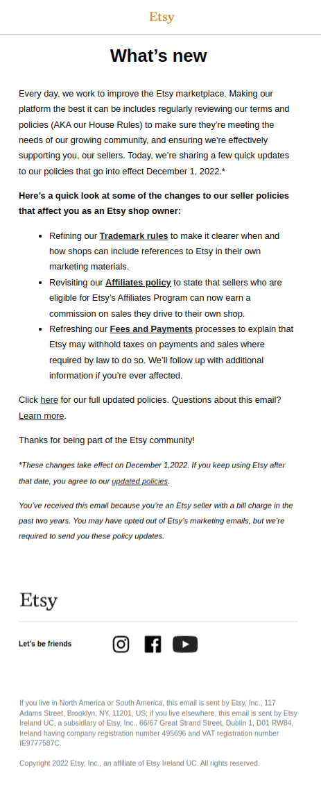
Etsy is an eCommerce marketplace that lets you sell multiple designer products online. Their email blast is a classic example of a text-based email.
Why it works
Headline
Only sometimes you’ll need attractive images to persuade customers; if it’s a priority message, a text-based email will do fine, just like the example above. The headline sets the tone of the email and makes readers curious enough to go on reading.
Email body
No extravagant elements are used in the email as it is an email that explains the new policy changes. Policies play a vital role in eCommerce marketplaces, and it looks like this email was blasted out to all the sellers on Etsy.
Etsy knows that the recipients will read the entire email no matter what, since it is a high-priority message. So, they didn’t need graphics; just simple content to convey the new policy.
CTA
Emails like these generally use less attractive CTAs. The email only provides a gist of the policies. Users will want to know more about the policies, and Etsy knows that, so a simple hyperlink is all they need to get their users to act.
Policy updates should not be ignored, so the next time you send a policy update email, remember that a simple text-based email will work better than a fancy sales offer kind of email.
Read also: 10 Examples of Email Marketing Strategies That Work
LastPass
Here’s another all-texter; this one from LastPass.
If Etsy’s email was based on priority, then LastPass’s email is based on the severity of the situation.

Why it works
Headline
It triggers the emotion right away. It is 2022, and no one wants to answer ‘No’ to the question asked in the headline. I loved the way they started with a question and then mentioned the main point of the email.
It is a great way to grab attention and drive recipients to read more of the email.
Email body
Security is a major concern in this digital age, and LastPass is a password protector used by businesses and individuals. They are responsible for keeping their customers safe, so they send this email with a checklist.
No images were used because none were needed. The checklist does the job; it will push the readers to check if their details are secured, and they’ve added hyperlinks for the email recipients to learn more about the security options.
In this email, they triggered a sense of emergency brilliantly and also pitched a membership upgrade subtly.
Yes, it is an upsell message, but they masked it well by using severity as the trigger.
CTA
The email seems educational at the beginning as you scroll down, and the bright CTA captures your attention. Only then do we realize they’re asking for an upgrade. So, they achieve two goals in one email: educate the users, and get them to pay more 😅
Remember, if you push your customers to upgrade via email, they may resist. Instead, do it like LastPass — send an informative, fun email and subtly nudge them to upgrade.
Read also: 5+ Great Follow Up Email Examples You Need To Know
Lou and Grey
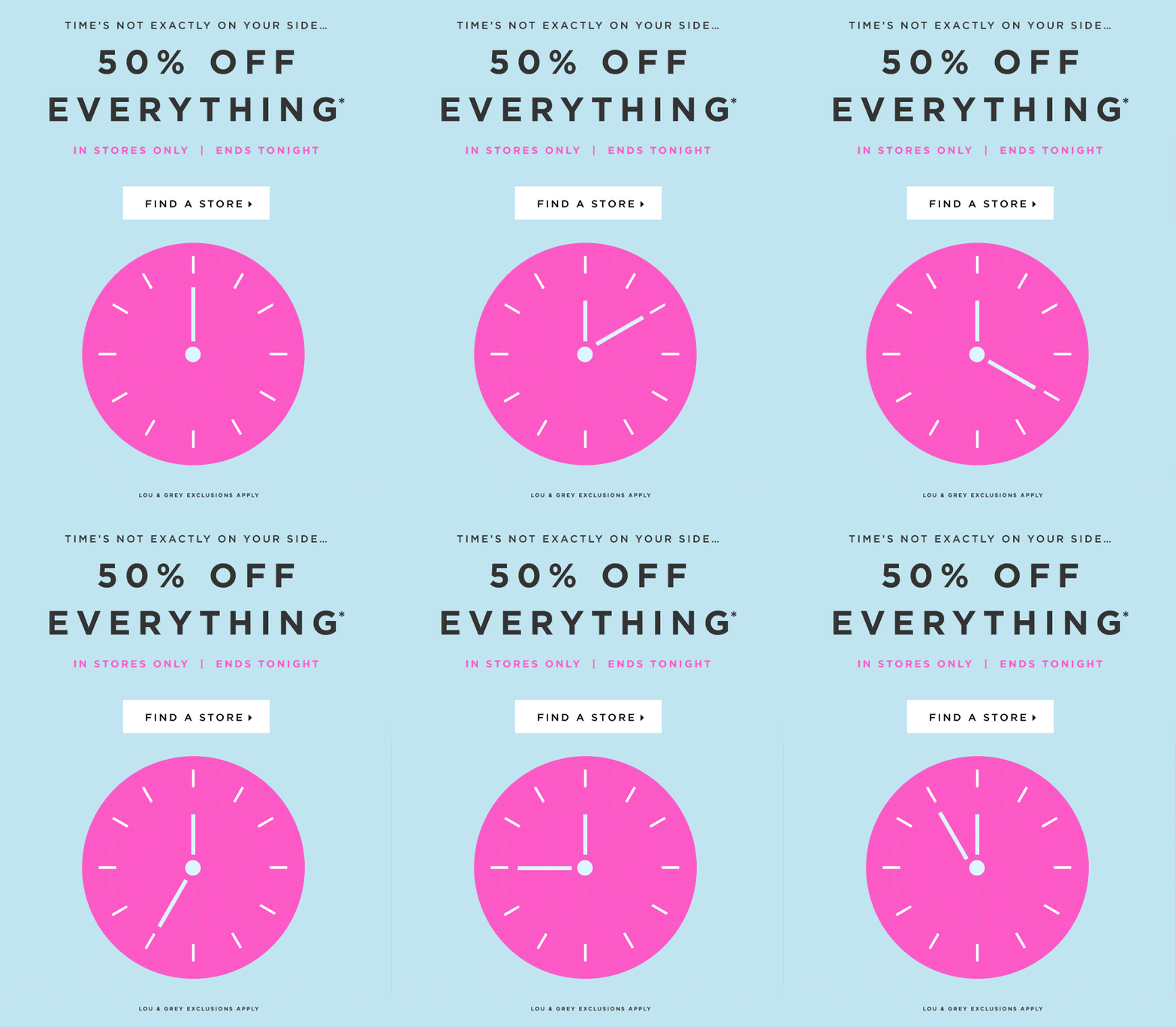
Here’s a good example of how to nail the routine Black Friday email blast that all eCommerce stores send out on D-day. Lou and Grey did minimalistic but fun work on their email 👇
Why it works
Headline
Black Friday is a time-sensitive deal. You can use that to trigger FOMO among customers; this headline does it well. The offer will push the customers to head to the store before the deal ends.
Email body
Lou and Grey didn’t write much copy in their email body. Considering Black Friday lasts only a day, they used a clock to convey the message of time running out (FOMO).
A GIF works perfectly during times like these. Some brands believe adding product images to their Black Friday email blast might overwhelm the customers.
Lou and Grey must’ve thought about that when they decided to use the GIF image of a running clock instead of using product images.
CTA
This example has a minimalistic CTA that matches the design of the email.
Read also: The 10 Best Opt-in Email Strategies (with Examples)
Shopify
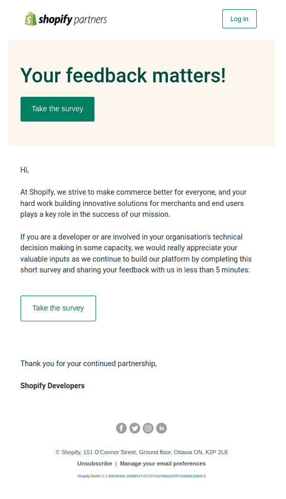
Customers and their voices are crucial for the success of your business. Getting valuable feedback from them will help you understand what they’re thinking about your product and reveal the areas where improvement is needed. And Shopify nailed the feedback email for its ‘partners’.
Why it works
Headline
Shopify just stuck to the framework and used the most common headline that you see in feedback emails. But it can positively impact the recipients; although common now, the headline conveys a key message.
Email body
Simple content where Shopify tells their partners how important their opinion is. Listening to customers and customizing their brand experience will increase customer loyalty and retention.
CTA
Shopify used the CTA twice in the email, but that’s because there’s quite a bit of copy. If your copy is short, add the CTA button only once.
Read also: How To Write The Perfect Christmas Email [+ Fresh Subject Lines]
Grammarly
The last one in our list of email blast examples comes from Grammarly, and they did a great job with it.
How to get your Freemium users to upgrade to premium plans? Educate them about the plan and the benefits they can earn if they upgrade. Grammarly nailed that in their email blast.

Why it works
Headline
The headline is simple but flows well with the email message. Also, it doesn’t ask users to upgrade. By leaving it open through the question, Grammarly is using the language smartly. No surprises there 😄
Email body
The email body is split into three sections. The first section clearly explains the features people can enjoy by upgrading to premium.
This is followed by multiple bullet points that explain how upgrading can help writers craft their articles better. It’s a great way to trigger the purchase instinct.
And then comes the section for pricing plans; this seems like an excellent placement because if they’re reading, the users would’ve reached the point of considering an upgrade.
It is a clear explanation of the pricing plans and a statement that tells customers how they can save money by upgrading to an annual plan instead of a monthly subscription.
CTA
Grammarly kept their CTA simple, probably because they did not want the email to sound too salesy. It is always best to keep your CTA short and simple; its only job is to inspire action.
Read also: B2B Email Marketing Examples From Billion Dollar Companies
Wrapping Up
Email blasts are a great way to reach multiple customers simultaneously and inform them of major announcements, product updates, and more.
All the email blast examples we listed in this blog post had excellent design language and crisp copies. We hope they inspire you well.
If you’re looking for an email marketing automation tool with many other B2C and B2B marketing and sales automation features, try EngageBay.
EngageBay offers unlimited contacts, email blast features, social media management, personalization through targeted emails, and more.
It’s loved by 46,500+ small businesses already — See reviews on Capterra.
eCommerce Email Marketing Simplified: 15 Examples + Tips
Email Blast FAQs
When is it appropriate to send email blasts?
Email blasts are not sent daily like transactional or post-purchase emails. Send an email blast only when there is a major announcement like a holiday season sale, product updates, etc.
Some occasions when it is appropriate to send an email blast:
- Major sales offers (e.g., Black Friday)
- Product updates, improvements
- When there are some insights to share in email newsletters
- When you have some special offer to re-engage with lost customers
- When you need feedback, a survey, or a review
- Updates in your company policy
Read also: eCommerce Email Copy: 12 Tricks to Drive More Conversions
What to include in an email blast?
Well, follow this short and simple checklist:
- Write awesome subject lines; make sure they’re crisp
- Avoid too many HTML elements in your email body
- Say the most important thing first
- Make your CTA super easy to find and click
- Add any information that can help as additional context
Read also: 14 Great Win-Back Email Examples Customers Can’t Resist
How often should I send email blasts?
It depends on your objective, and you must consider your customers. Sending email blasts too often will frustrate them, and they’ll probably trigger spam filters and mark yours as such. Avoid sending more than four email blasts a month.

