When it comes to online marketing, there are a lot of different options to choose from. But one of the most effective – and underutilized – methods is the exit intent popup.
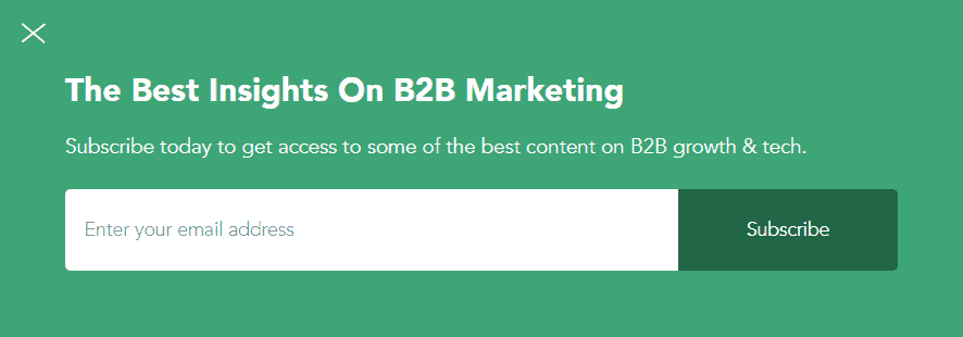
An exit intent popup is a message that pops up on the screen as a website visitor is about to leave your website. It’s an opportunity to offer them something valuable in exchange for staying on your site, such as a discount, free shipping, or bonus content.
If you’re not using exit intent popups yet, you’re missing out on a huge opportunity to increase your sales and engagement.
In this blog post, we’ll share some examples of effective exit intent popups. We’ll also share proven tips to help you create popups that boost conversions.
Table of Contents
The Importance of Exit Intent Popups
Before we get into the examples, it’s important to understand why exit intent popups matter.
There are a few key reasons:
- They’re highly effective. Exit intent popups have been shown to get email signups from up to 7% of all website visitors.
- They’re easy to create. You don’t need any coding skills or special software. There are plenty of tools that allow you to create exit intent popups with just a few clicks.
- They’re versatile. Exit intent popups can be used for a variety of purposes, such as growing your email list, promoting a sale, or increasing engagement with your content.
- They’re unobtrusive. Unlike other types of popups, exit intent popups only appear when a website visitor is about to leave the web page. This means that they won’t interfere with the user experience or cause annoyance.
- They’re responsive. Exit intent popups are designed to be mobile-friendly and work on all devices.
Moreover, exit intent strategies are known to increase conversion rates from a meager 3.09% to anything between 10% and 60%.
So how do exit intent popups work?
If you have a website, blog, or e-commerce store, you can use exit intent technology that detects user actions while they are on a web page.
When the cursor is detected to be moving towards the exit icon, the exit intent popup tool identifies it and pops up a message to capture the attention of the website visitor.
This way, you get a great conversion optimization boost, and with very little effort or marketing spend.
15 Exit Intent Popup Examples That Drive Conversions
Now that you know why exit intent popups are so important, let’s take a look at some examples of effective ones in action.
#1. Skullcandy
Skullcandy is an American company that specializes in headphones, earphones, audio backpacks, MP3 players, and other hands-free devices.
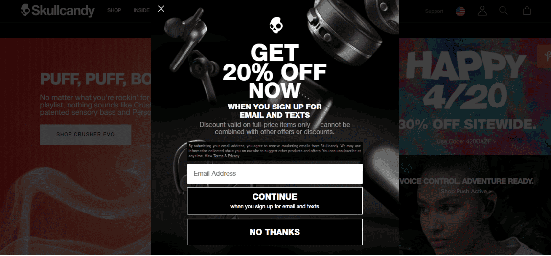
Its exit intent popup example tries to convince first-time customers to make a purchase by offering them a 20% discount. However, the discount would only be available once the customers have subscribed to Skullcandy’s mailing list.
This ensures the brand more revenue as well as adds to the mailing list, making them eligible for similar offers in the future.
Skullcandy also smartly adds a ‘No Thanks’ bar below the ‘Continue’ tab for visitors who are getting ready to leave the website.
#2. La Roche-Posay
La Roche-Posay is a French skincare brand owned by Loreal. Like many e-commerce retailers, when a visitor moves their cursor towards the cross sign, the brand shows an exit popup.
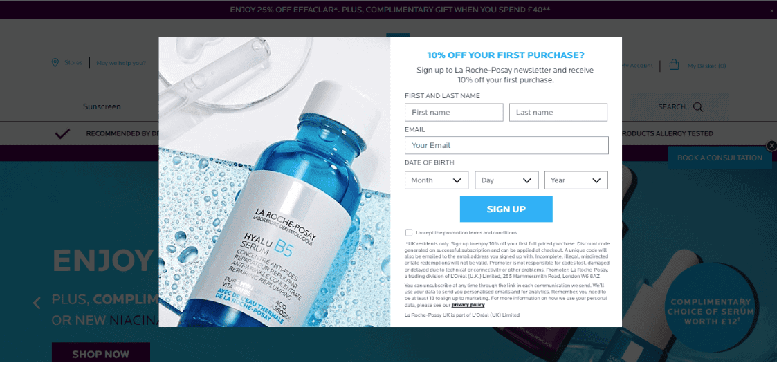
They try to entice their visitors to subscribe to its mailing list by offering them a 10% discount on their first purchase.
Users simply need to provide basic information such as their name, email address, and date of birth, to receive discounts and other promotional offers from La Roche-Posay.
#3. Waitrose
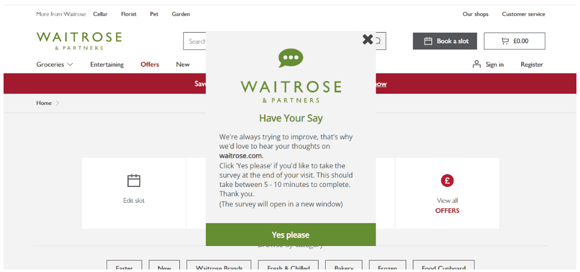
Waitrose is a British supermarket chain founded in the year 1937. In the example above, Waitrose is making the right use of the exit intent popup to take a short survey of their visitors.
This survey is intended to help Waitrose understand the positive and negative aspects of their website, and what they can do to improve the customer experience.
By using surveys as exit popups, Waitrose is trying to convey that customer satisfaction is of utmost importance. Surveys help gauge user perception of a brand and help improve a company’s products and services.
This will also increase conversions, as visitors would want to keep coming back to the website in the future.
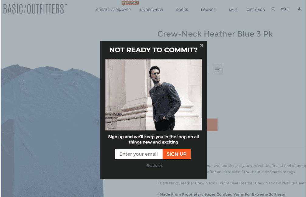
#4. Basic Outfitters
Basic Outfitters is an American online retail brand founded in the year 2014.
Basic Outfitters smartly puts up an exit intent popup asking visitors ready to leave, “Note ready to commit?”
In this exit intent pop up example, the brand tries to persuade its visitors to make a purchase later. Even if someone is not interested in buying from Basic Outfitters right now, by signing up for its mailing list, they will be informed of any future offers, which may interest them.
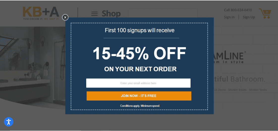
#5. KBauthority
KBauthority is an American retail brand that sells bathroom fittings such as sinks, faucets, shower doors and panels, and kitchen equipment.
Here, the brand is trying to convince users to make a purchase by creating a sense of urgency. It wants people to sign-up as soon as possible.
If the customers are lucky enough to be among the first 100 subscribers, they would become eligible for a discount ranging between 15% and 45% on their next order.
What’s more, by stating that the joining process is free, prospective customers don’t have to worry about paying anything to subscribe.
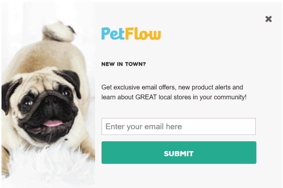
#6. Pet Flow
Pet Flow is a brand that sells pet essentials such as animal food, animal clothing and essentials, and other equipment.
Its exit intent popup window helps you subscribe by providing your email address. Once you have entered your email address and clicked ‘Submit’, you will be sent regular updates about any new products, email offers, and other offers running in the local stores in and around your community.
No pet lovers would like to miss an amazing deal.
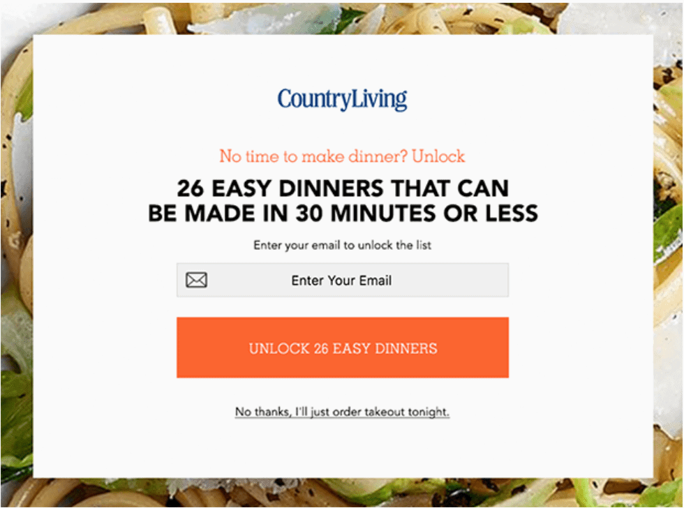
#7. CountryLiving
CountryLiving is a website that provides advice on cooking and lifestyle. The example shown here attempts to make visitors excited about the article ‘26 Easy Dinners That Can Be Made In 30 Minutes Or Less.’
It captures people’s attention by specifically mentioning “…made in 30 minutes or less.”
Once you have entered your email address, you will get access to the article along with many other similar blogs in the future.
Further, CountryLiving has cleverly added the link ‘No thanks, I’ll just order takeout tonight’ in a smaller font so that people would overlook it and end up signing up for the mailing list.
Read more: Lead Magnets 101 — Why You Need Them and How to Use Them
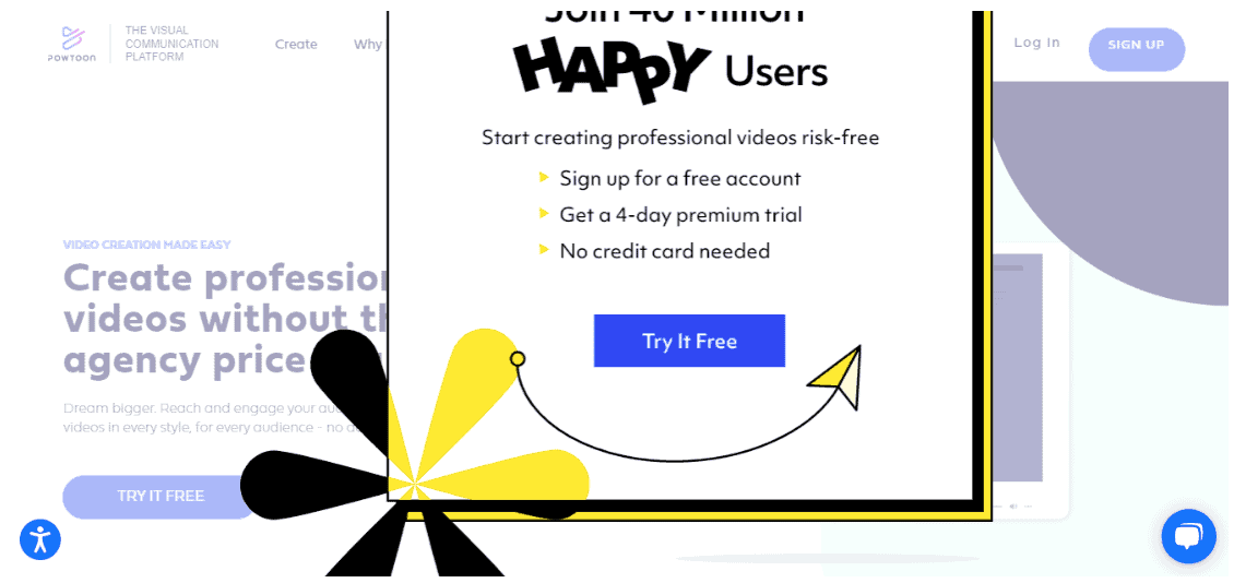
#8. Powtoons
Powtoons is a British company that sells cloud-based animation software to create animated presentations and explainer videos.
The exit intent popup window in this example is to persuade visitors to simply try out the software’s features, free of cost.
Visitors are also given incentives such as a 4-day premium trial with a free account and no credit card details.
Once they have signed up, users can try out the Powtoons platform and later, purchase a paid plan. And if not, they will be sent discounts and offers through email.
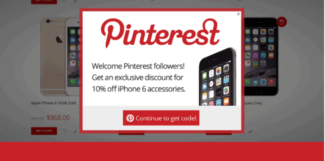
#9. Pinterest
Pinterest is an image sharing and social media platform that helps you save and discover information using images, GIFs, and animated videos.
The platform helps convince Pinterest followers to sign up for a special offer in order to get a 10% discount on iPhone 6 and its accessories.
What’s more, the visitors don’t have to sign up to Pinterest, as it is only for existing subscribers.
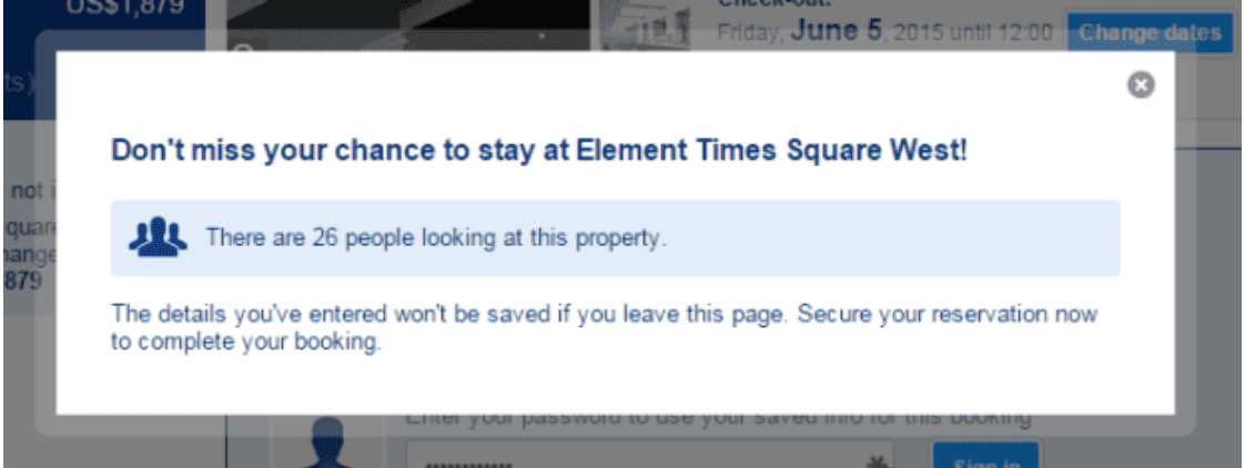
#10. Booking.com
Booking.com is a Dutch online travel portal that helps you make reservations for hotels, lodging, car rentals, taxis, and flights across Europe.
When a user tends to leave the site without completing their bookings, it displays an exit popup.
In this popup, they smartly display how many people looking to reserve the same property, creating a sense of FOMO (fear of missing out).
This helps clients understand how popular or famous a lodging, flight, or place might be. It convinces them to finalize their booking before it gets sold out or they miss out on popular deals.
Read also: Website Popups — 10 Rules You Should Follow for Better Engagement
#11. Social Triggers
Social Triggers is a digital marketing website that helps individuals and companies design and implements Internet marketing strategies for website conversions.
While the company does not ask users to subscribe right away, it uses an exit intent popup window to ask them to sign up for its free ebook.
The ebook contains a range of examples on how to improve customer loyalty using successful marketing tactics. You can get the ebook delivered right to your inbox by providing your email address.
It’s a great tactic to collect its potential customer’s email address and later use it to nurture them via email marketing.
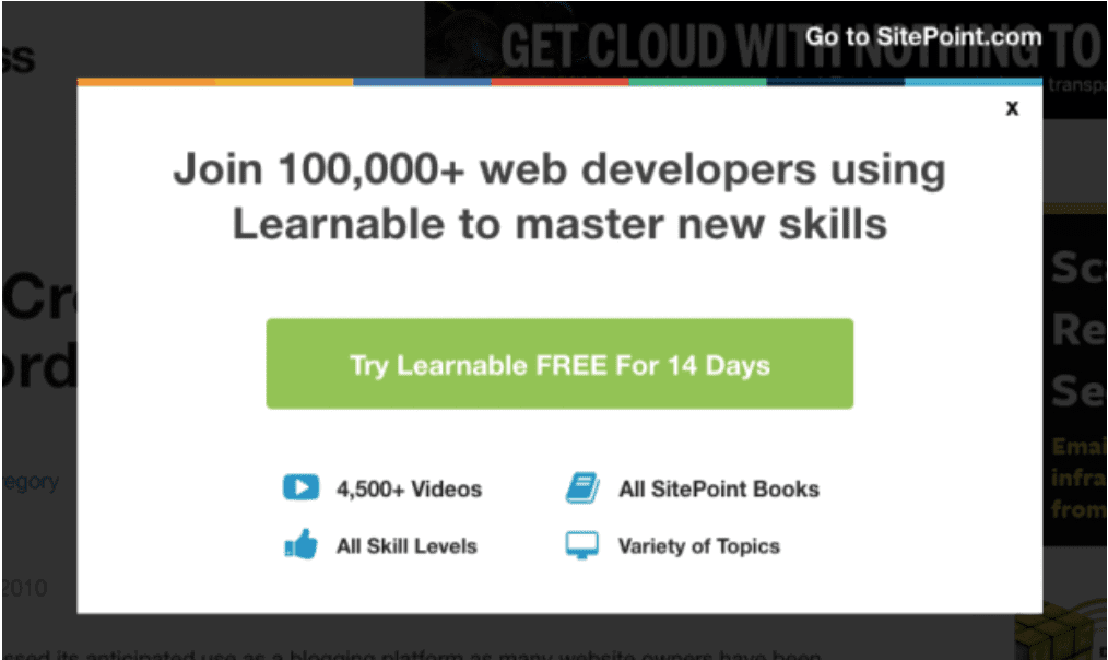
#12. SitePoint
SitePoint is a website that provides online courses on web development and a range of programming languages.
The company uses an exit intent popup to request visitors to sign up for a free 14-day trial.
The free trial consists of numerous videos, topics, and various other resources. As a result, users get to know which courses are offered by SitePoint, their quality and content, and how they will be useful for them.
This will help them decide whether they want to continue and purchase SitePoint’s courses later or not.
#13. Neil Patel
Neil Patel is a New York Times bestselling author and one of the best marketers in the world.
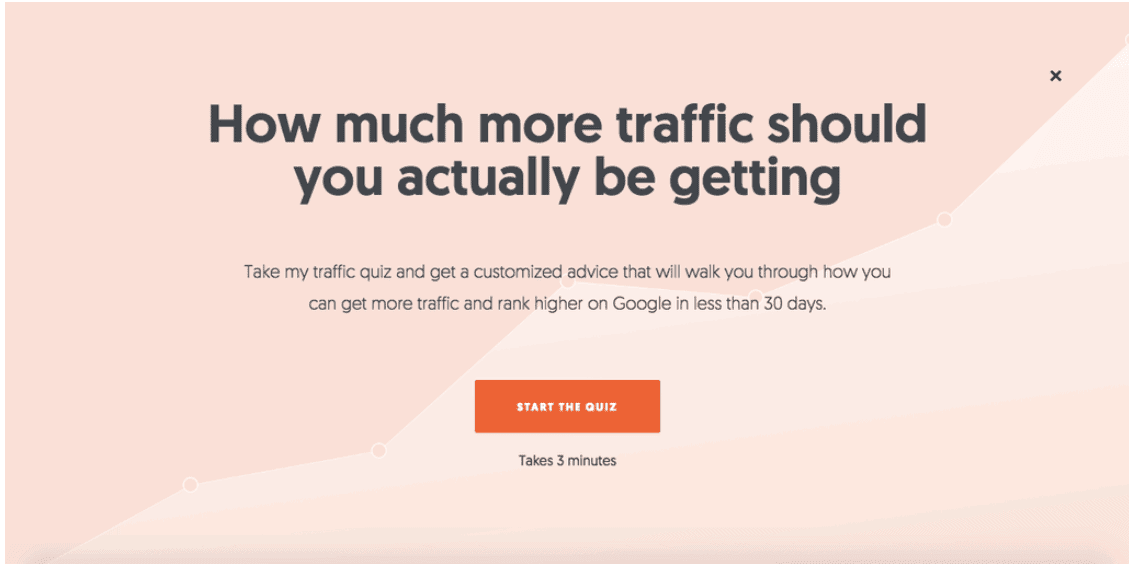
On browsing through Neil Patel’s website, an exit intent popup would appear on the screen, providing you with customized advice on how to increase traffic and the ranking of your website on Google.
The advice is delivered based on a short, three-minute quiz.
By mentioning the time taken to complete the quiz, users can decide whether to spend more time on the website or not.
Moreover, the website provides free customized advice initially, helping businesses choose whether they would like to purchase any other products or not.
#14. Fundera
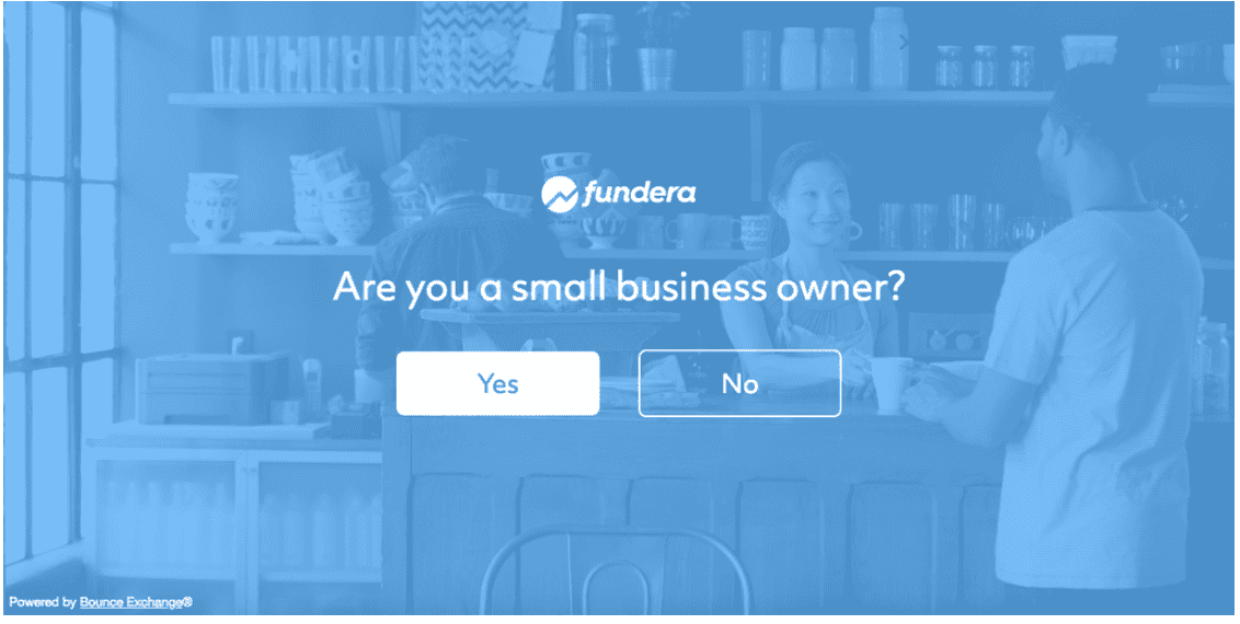
Fundera is a US-based website that offers loans to small businesses. Upon heading to Fundera’s homepage, an exit popup would appear, asking whether the visitor is a small business owner.
On clicking ‘Yes’, visitors would then be asked further questions related to their business, followed by the loan options offered by Fundera and its benefits.
The website has deliberately highlighted the ‘Yes’ tab, implying that Fundera is intended for small businesses only.
#15. Scott’s Cheap Flights
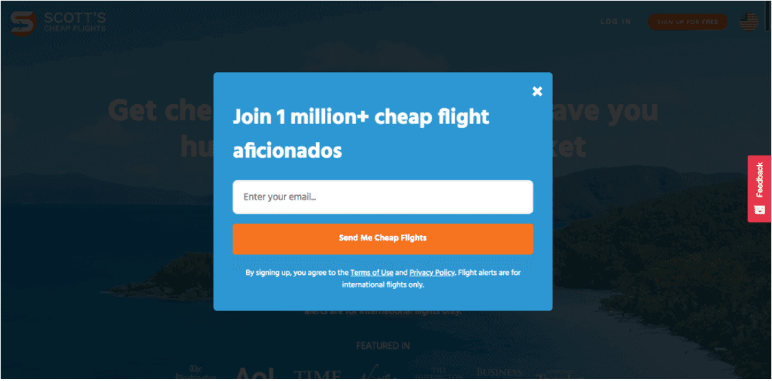
Scott’s Cheap Flights is a website that helps you find the right deals for your next flight so that you don’t overpay again.
Here, the website asks visitors to subscribe to its mailing list to receive alerts on flight prices. To build brand credibility, the exit intent popup window mentions the number of existing subscribers.
Further, the submit button tries to convince users to sign-up by including the message ‘Send Me Cheap Flights’ on the submit button.
Tips for Creating Successful Exit Intent Popups
Now that you have looked at several exit intent popup examples, it is time to create your own.
Here are some of the best practices that you can follow while creating exit intent popups.
#1. Keep It Short and Simple
In order to create an exit intent popup that leaves an impression, keep it short and simple – not more than one to two lines.
The message should not convey everything about your brand, else the users will not be convinced to sign up or subscribe. Moreover, ensure that the message clearly mentions the benefits customers will get upon subscribing to your brand.
Since you don’t want your visitors to leave your website, make sure that the exit intent popup catches their attention quickly and requires minimum effort from their end.
#2. Focus On the Popup Message
If you are creating a single popup for your website, it may not be very effective.
While asking users to sign up or subscribe to your newsletter and promotional offers may be suitable for a homepage, it may not be for users browsing certain product or service pages.
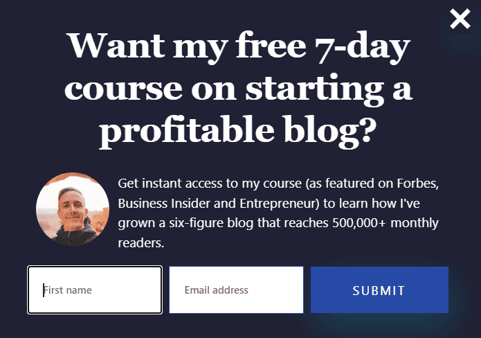
Thus, try and target the popup by changing the exit intent message according to the page your customers are on.
For instance, blogging and content marketing expert Ryan Robinson has this popup on some of his web pages. The message is tailored for people who are reading a blog about how to start a revenue-generating blog, so they may benefit from guidance on the subject:
#3. Create a Sense Of Urgency
While browsing through your online website, some customers may add products to their shopping cart and not make a purchase.
They might have decided to come back later or found a better deal elsewhere. However, if you want your visitors to convert, you should create a sense of urgency.
By urgency, it implies providing discounts or promotional offers that are only valid for a very limited period of time.
The offer could be available only for the next half an hour or one hour.
You can also add a timer to your website so that customers know how long they have till the offer expires. As a result, users will take fast action in the fear of missing out on the deal.
#4. Ask For Very Little
While asking people to sign up, make sure that you are only asking the important or relevant information.
The relevant details usually include the name of the customer, their email address, and phone number. It is better to avoid asking for personal information such as age, place of residence, marital status, and so on, as it can reduce the trust in your brand.
Moreover, by asking for too much information, a site visitor may be discouraged and leave the sign-up process midway.
While certain websites require further information from their patrons, such as brands that prescribe diets and workout plans, most do not.
Hence, it is best that you only ask your customers for as little information as you absolutely need, like this:
#5. Include Social Proof
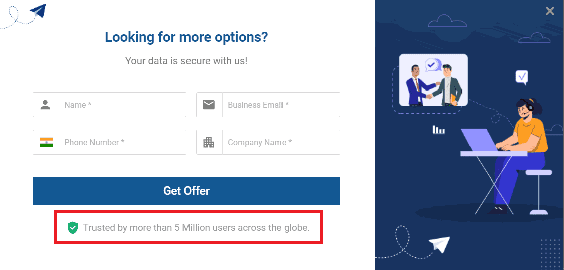
To build trust in your brand, you can include social proof in the form of testimonials and customer reviews.
These can also include a couple of lines on the experience of customers after purchasing your product or service, along with any recommendations.
Here’s a good example from SoftwareSuggest of adding social proof to your exit intent popup:
Conclusion
To conclude, exit intent popups encourage people to subscribe to your brand and make purchases.
By offering incentives such as discounts, freebies, and other promotional offers, you can persuade people to keep buying from you again and again.
These exit intent popup examples should help you understand how other brands are taking advantage of exit intent technology, and how you can drive high conversions from your website or blog as well.
If you’d like to know how EngageBay can help you make website popups for your marketing, just sign up for free and we’ll get in touch with you!

