Most marketers refrain from using website popups. They believe that it annoys visitors and destroys the user experience.
Despite this popular belief, many websites are still using the old mechanism of displaying popups. Have you wondered why?
This is because popups work. But while displaying popups on the website, you need to take care of the design and the message you are trying to convey.
If a popup is to the point and can add value to your user’s visit, you can even move them down the sales funnel.
Using a popup has its own benefits. Let me show you how you can use the pop ups to nurture your leads without hurting your traffic and conversions.
Table of Contents
What Are Web Popups?
Website popups are nothing but a small box that gets displayed as soon as you visit a web page.
Generally, these popups are asking for your email ID to send you a discount or offer. Or else, they redirect you to a landing page of an ongoing campaign.
Interestingly enough, it was first used by Zuckerman in the late 90s to launch advertisements in separate windows. But he later apologized for the unforeseen nuisance that these pop ads have evolved into.
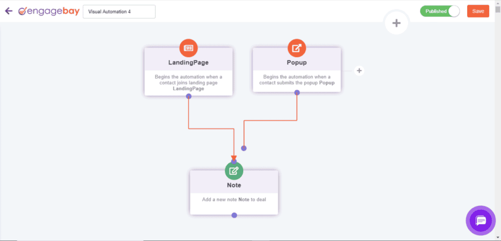
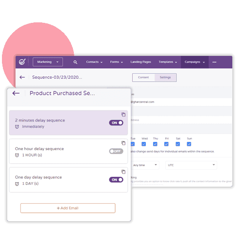
Design web popups in new and innovative ways using the marketing automation tool and capture leads.
Why are Popups Important?
In a survey, 73% of internet users disapproved of pop-up ads.
Despite this anti-attitude, users are seen engaging with web popups.
Popups have a decent click-through rate of 2%, which is higher than other kinds of ads. Besides, BitNinja increased subscriptions by 114% through popups.
Why you need to use website popups?
Here are some reasons, why you need to use website popups:
i. Generate Subscribers
One of the biggest challenges of B2B companies is to generate leads.
Most of them have no clue how to engage visitors on their site or grow their email list.
Web popups are a great way to entice users to subscribe to your newsletter by offering them discount coupons or free ebooks.
It allows you to grow your mailing list, nurture relationships with your audiences via email, and speed up the buyer’s journey.
ii. Promote Specific Content
Who doesn’t like free stuff? And even more, when it is going to add some value.
When you promote a free ebook, guide, or case study relevant to the visitors, they are more likely to provide their information and engage with your site.
It also helps establish authority over the subject matter and gain your visitors’ trust.
iii. Reduce the Bounce Rate
Bounce rate is how fast a user leaves your site. This is an important metric for your SEO purpose too. If your bounce rate is high, Google will not show your page on the first page of SERP.
A high bounce rate implies a bad user experience.
Many marketers use website popups to reduce bounce rate — asking for email addresses or other information to engage them.
Generally, these popups appear when they are about to leave. It is also known as exit popups (more on that later).
Should I Use Pop-Ups on My Website? – A Video:
[su_youtube url=”https://www.youtube.com/watch?v=wWgPhy4c4h8″ title=”Should I Use Pop-Ups on My Website?”]
Types of Website Popups
A website popup is a great way to drive engagement on the site.
There are four distinct types of popups designed to serve different purposes. Let’s look and understand how you can use one of them for the lead generation process.
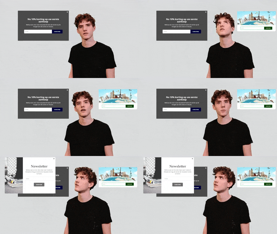
Exit-intent Popup (Goodbye)
Exit-intent is the term used to describe a visitor’s behavior when they are about to leave your site.
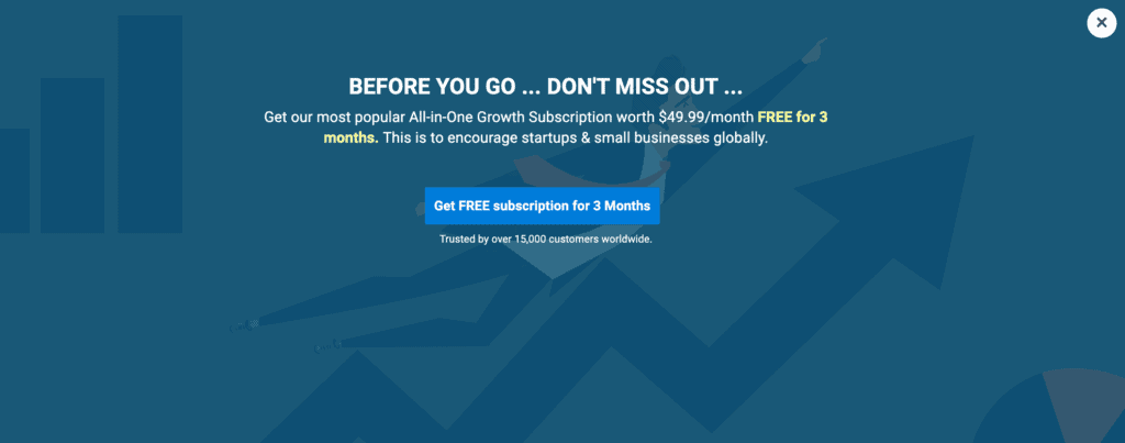
When they move their mouse towards the closing ‘X’ button or the address bar, the behavior is detected as exit-intent. Right at that moment, a popup is displayed to distract them from leaving.
If they find the popup appealing, they might stick around and take action. In short, exit-intent popups are used to change their mind or capture emails before they leave.
Here’s how EngageBay does it.
Time-based Popup (Watchdog)
Time-based popups are displayed based on the amount of time someone has been inactive on the site. If they have been inactive for more than a minute, it’s an excellent time to remind them that they are missing something.
But if the user has already changed the tab, the chances are that they missed the popups.
In such cases, the best approach is to combine a time-triggered popup with a short click sound. Make sure that it isn’t an annoying beep.
It will immediately grab your user’s attention as they will see a tiny ‘loudspeaker’ icon on your website’s tab.
Using this time-intent popup, you can ask for email addresses or offer a discount coupon.
Scroll-triggered Popup (Read More)
Scroll-triggered popups are based on how far a visitor has scrolled down a page on your website.
While a user is reading a blog, and they have scrolled to a section’ lead generation best practices,’ you can display a popup with a free ebook — lets’ say, “a free guide on lead generation process.’
Click-activated Popup (Click Me)
Click-activated popups are the best options for those marketers who are skeptical about using popups.
It only shows the popup when the user clicks on a certain link, banner, or button.
10 Tips for Better Website Popups
Here are a few tips and tricks that might come in handy for displaying effective website popups.
1. Keep Your Website Popups Branded to Match Your Aesthetics
One reason why popups feel annoying is that they look like they were randomly added to the site. The colors and aesthetic doesn’t match with the website.
When they don’t fit in with the branding of the website, they look cheap, sales-y, and aggressive.
Yes, website popups are supposed to stand out. The word itself — “popup” — implies as much. But this does not mean it shouldn’t match your branding and overall voice.
Use similar colors and fonts that complement your brand color. It’s crucial to maintain consistency in terms of branding across all your platforms — from your website to social media pages and email marketing.
It helps you maintain a flow and send out a cohesive brand message. A pesky popup shouldn’t interrupt that.
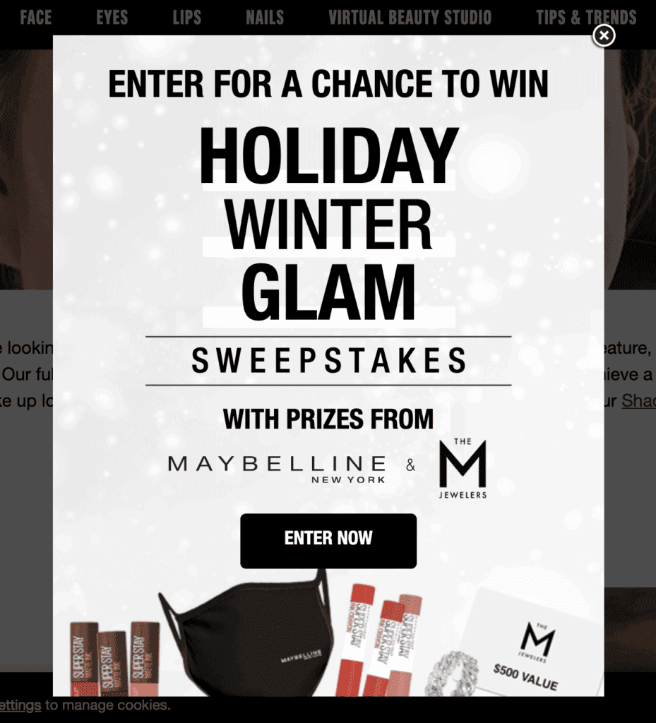
Look at how Maybelline did this with their popup.
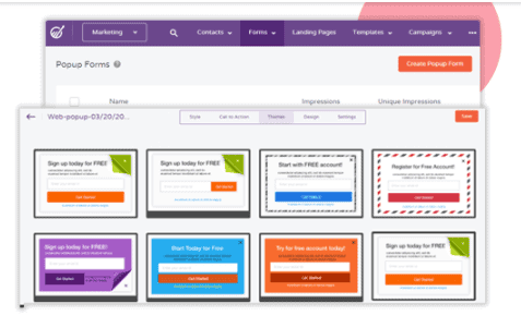
EngageBay allows you to choose from a wide selection of ready-made templates and customize it to your needs.
2. Solve a Problem
With your website popups, you should aim at solving your visitors’ problems. You should know what their interests are and what they need.
On a side note, CRM software can help collect your target audience information and analyze them to understand their interests and wants.
When you have the required information, you can offer something that they might need.
To give you an example, a plumber gets a lot of calls about running toilets. Now, it’s a common household problem that people can fix themselves — but they don’t know how to do it.
You can make a popup out of it, say — quick tips on how to fix a running toilet problem. You can offer them a free ebook or take them to another web page.
It helps people immediately solve a problem they have faced in the past and would like to know how to handle it in the future.
Here’s another example — if you are a nutritionist, you might offer a popup with your top 10 quick and healthy snacks.
People are busy and overwhelmed with life responsibilities, and health often gets put on the back burner.
Offer them a quick and simple solution — you can figure out the best snacks for them so that they don’t have to.
One important thing to note here is that your popup should not only solve a common problem but also make for a quick win.
What I’m saying is that don’t offer a solution that will take weeks or months to accomplish. Instead, give them something to solve their problem immediately. People want instant gratification.
Notice with the two prior examples, they offer immediate solutions that people can use in real-time.
As an example of what not to do, think of that same nutritionist offering recipes to help people drop weight in the next six months.
There’s nothing exciting about something happening six months from now, even if the information you provide is super valuable. So this might not make for the best popup.
3. Have a Clear and Obvious Call-to-Action
A little mystery can be a good thing, but this isn’t one of those times. Don’t leave your visitors guessing when it comes to the functionality and appearance of your popups.
Playing hard to get is an easy way to drive people away from your site. It’s better to put it all out there.
The simplest way to do this is by having a crystal clear call-to-action (CTA) on your popups. For instance, you can ask them to:
- “Fill out the information below to receive our free guide.”
- “Enter your name and email address for a chance to win.”
- “Just provide your email address to start your free trial.”
These examples clearly state two things — a) the information they are required to provide & b) what they will receive when they do so.
Bear in mind that people are understandably hesitant to provide any of their personal information. They already get enough emails, most of which they probably never open.
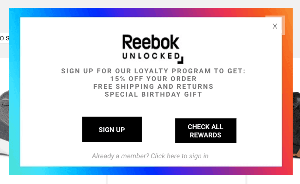
Here’s a good example from Reebok, who leaves nothing to the imagination.
Don’t take this lightly. You are asking your visitors to share their information with you. You don’t want to scare them away.
Because once that happens, it will be hard to get them back, and you risk losing a potential lead.
4. Acknowledge Submission of Information
You can simply make a popup disappear after someone submits their information. This might look like the best option and offer a clean user experience. But it can get a little mysterious.
And as you know by now, when it comes to website popups, we are not going for mysterious.
It can be concerning to provide your email address to a website, and then the popup just vanishes. A little confirmation goes a long way.
Set your pop up so that after someone has provided their information, they receive some sort of “thank you” message confirming their action. It’s a small detail that makes a big difference. Besides, it helps build trust.
5. Make it Easy for People to Get Rid of It
Yes, you read that right. Visitors should be able to quickly and easily get out of your popup if they want to.
Not every time, a visitor would want to share their information.
Persistence is great but to a certain limit. Making it difficult for someone to remove your popup will only hurt the user experience.
But there are times when they accidentally close the popup window or change their mind later. In such cases, it’s good to offer the opportunity to opt-in elsewhere on the site.
For instance, if you have a popup asking people to enter your contest, you can have a CTA somewhere else on your website prompting them to enter.
This gives them the option to rethink about it without aggressively pushing a website popup on them.
6. Ask for as Little Information as Possible
People have neither the time nor the patience (nor the trust) to fill out lengthy and demanding website popups. For this reason, your popup should have only the fields required and no more.
If you don’t need people’s last names and phone numbers, don’t ask for them! Yes, it can be nice to have as much information as possible, but that’s not how they see it.
In fact, it’s the exact opposite for them. They want to provide as little information as possible and still receive whatever you are offering.
More often than not, a first name and email address will do. Of course, this might change depending on the popup. The point is to make your visitors do as little work as possible. Otherwise, your popup won’t convert.
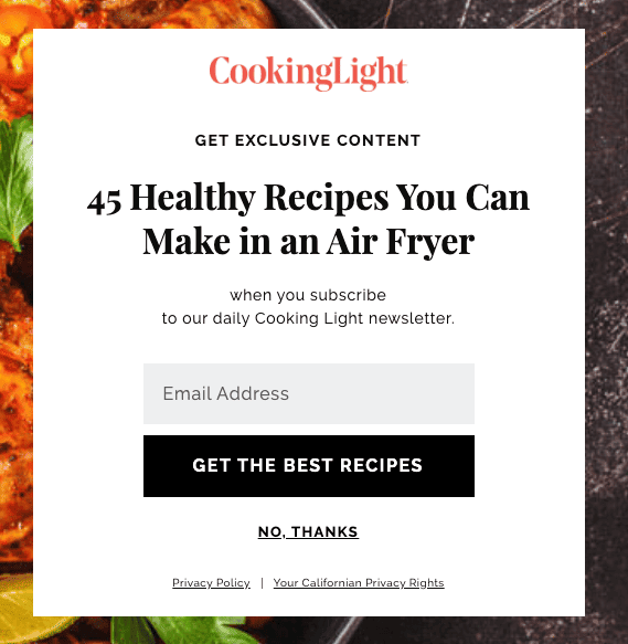
Look at Cooking Light, which doesn’t even ask for a first name. So simple, so easy!
7. Use Specific Triggers and Timings
There are all kinds of website popups. Some will appear a few seconds after a visitor lands on your site. Others, right before they leave.
Some are triggered by specific actions that the user takes.
It’s up to you to decide what’s best for your brand and your goals. Very often, popups that appear a few seconds after someone lands on your site are not the best route to take.
This is because they haven’t had a chance to get to know your brand yet.
You haven’t nurtured the relationship with your visitors at all. At this point, asking them for their contact information might be pointless and damage your business reputation.
The more personalized of an experience you can create, the better it is. A visitor doesn’t want to be treated like everybody else who comes to your website.
The most effective way of displaying a web popup is to customize it based on the user’s behavior. For this reason, action-triggered popups can work very well.
8. Tag Subscribers and Put Them Into Specific Email Sequences
A website popup is a great way to grow your email list. A growing email list is the backbone of a business as email marketing has the highest ROI of any type.
When you collect those email addresses, you deliver them the content you promised in the popup. But it doesn’t end there.
You tag those people and enter them into the appropriate email sequence to continue to nurture these leads.
For instance, your website popup is offering a free guide on ab exercises. It’s evident that people who are signing for those guides are interested in ab exercises.
So, once they enter your email system, you should segment them into a group and deliver more information over time relevant to their interests.
You can send regular emails that provide information for total core workouts, the best full-body workouts, or the best nutrition to lean out and have more defined abs.
You need to be building these relationships over time. This is what turns leads into loyal fans and loyal fans into paying customers.
Understandably, this process doesn’t seem all that appealing to brands. It’s more work on your end and a time-consuming process. Plus, it delays the gratification of getting new business.
However, acquiring new customers is often a lot like dating. You wouldn’t ask someone to marry you when you first meet them.
Similarly, you don’t ask a website visitor to fork over any cash the first time they land on your website. You have to date them before you can ask them to marry you.
Send highly targeted messages by scheduling email sequences to be sent to different lists.
9. Check Your Website Popups on Mobile
Today, websites are often already optimized for multiple devices, including mobile devices, tablets, and desktops.
Web pages automatically get resized and optimized to fit the size of that screen.
This is really important, because now more than ever, people are accessing the internet from their smartphones.
Don’t make any assumptions — visit your own website from your mobile device to see how the popup appears.
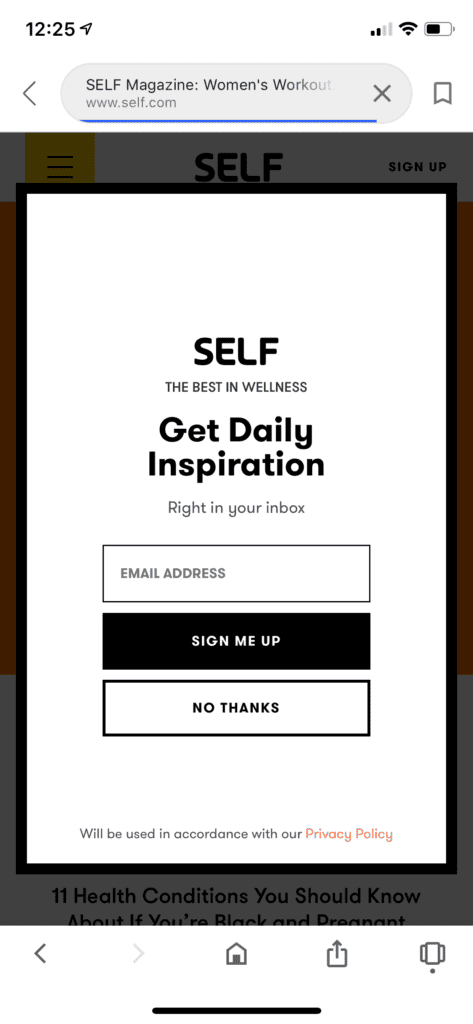
You need to make sure that the whole box fits within the screen so that the reader doesn’t have to use fingers to zoom in. Don’t compromise on the mobile experience for your visitors.
See how Self.com mobile popup is looking sharp.
10. Split Test the Variables of Your Website Popups
Testing is everything. Without it, you can’t know for sure what is working for your popups.
There are various factors that you need to keep testing, including:
- Font size and style
- Color of the banner
- CTA button
- Headings
- Images or no images
It will help you understand what your audiences like and how you further improve their experience.
Again, it’s equally important that you give enough time to test. Wait for more than 24 hours because making any change.
Give it a few days, if not a couple of weeks, to see if it made any impact and has delivered new results.
Nine times out of 10, things don’t happen overnight. You need to collect a big enough sampling of data to get a good read of the results of what you are testing.
Wrap Up
So, are you ready to leverage the power of popups on your own website? Put these website popups best tips into practice and grow your email list.
If you don’t already have one, then we recommend using the EngageBay marketing automation tool to get started.
Visit Engagebay’s website popups guide for more helpful information.

