Have you ever sent an email and expected it to get a high open rate, but it didn’t? You dig back into the original message to decode what may have gone wrong.
However, since you didn’t A/B test your email, any number of things could have impacted its success. Perhaps you chose the wrong send time, the subject lines needed a rework, or you didn’t have easily accessible CTA buttons.
A/B testing leaves nothing to chance. You can meticulously test every element of your email campaign before it goes live to increase open and clickthrough rates.
This guide article will explain how to optimize your eCommerce email marketing with smart A/B testing.
In this blog post, we’ll define what eCommerce email A/B testing means, show you what components of an email campaign you can A/B test, and share plenty of tips, examples, and best practices to begin sending eCommerce emails that convert.
Table of Contents
What Is eCommerce Email A/B Testing?

eCommerce email a/b testing refers to sending out two different versions of the same email to two different but small audiences. This helps understand which version gets better engagement, like better open rates or clickthrough rates.
For example, perhaps your CTA button is placed right above the fold at the top of your email in Version A but midway down the page in Version B. The button could also be a pink circle in Version A and a blue square in Version B.
You can generate multiple secondary versions to compare against the control. The point of testing these elements is to determine which version of your email will drive the most receptivity.
In other words, you’re seeking email design and features to boost your open and clickthrough rates.
Although we’re discussing email marketing A/B testing today, you can split-test any marketing campaign element, including your website, landing pages, forms, social media posts, infographics, blogs, and more.
The Benefits of A/B Testing Your eCommerce Emails
Testing emails before you send them can set up your campaign for success in the following ways:
- Your unsubscribe rate should decrease as you send email content catered to your audience segments.
- You’ll begin to understand better what your audience likes and dislikes, which instills confidence in future campaigns and might reduce your reliance on A/B testing.
- You’ll improve your engagement rate across emails.
- You’ll generate a higher ROI for each email you send and your overall campaigns.
- Your conversion rate should increase.
- Open and clickthrough rates should similarly go up.
Read also: The Beginner’s Guide to eCommerce Marketing Automation
9 eCommerce Email Elements to Begin A/B Testing Today
An email marketing campaign has many moving parts. The following elements are all fair game to A/B test to understand better what appeals to your target audience.
Call to Action button style and placement
CTA buttons come in all shapes and sizes. Which style of the button would best complement your campaign will vary depending on your brand, message, and visual style. You can compare endless CTA button variations until you find your favorite.
More important than the look of the CTA button is where it goes. Burying the button will make it hard to appreciate its visual appeal, and blending it into too many visual elements fails to drive the point home.
This is another element you must test before your next email campaign goes live.
Subject lines
According to HubSpot, in data cited from Mailchimp and Finances Online, 64 percent of email recipients will delete or open an email depending on the subject line content. That tells you all you need to know about the importance of email subject lines.
You can test all elements of your subject line, from its length to its wording and even the organization of the words. For example, one variation of your subject line might read, “Shop today to get free shipping,” and another might say, “Get free shipping when you shop today.”
The meaning is the same, but you could increase your open rate depending on how you organize the words.
Regarding the length of your subject lines, you can gauge whether the wording will get cut off on mobile devices, by sampling different versions of the subject line between 60 and 90 characters until you find the best one.
Read also: The Art of eCommerce Post-Purchase Emails [A Guide]
Email body

What’s the topic of your email? You can test subjects for the most compatible email style, such as a product/service announcement versus a newsletter.
You can also test offers in the email body to determine which wording and even which type of offer might appeal to your target audience.
Further, you can perform an A/B test to gauge the most appropriate tone given the email subject matter and adjust the length. The length of the email body includes the overall word count and how the information is formatted and presented.
For instance, is it better to split up a paragraph or leave it as one large block? Would bullet points help? You’ll soon have the answers.
Read also: eCommerce Emails: 50+ Basic and Advanced Segmentation Strategies
Email layout and design
We painstakingly select templates or hire designers for custom email layouts only to get underwhelming open and clickthrough rates. Fortunately, you can put those days behind you, as comparing visual elements is one of the best ways to A/B test.
You can examine several templates against your control, including custom templates, to see whether your audience prefers original or prebuilt templates.
You can begin incorporating those templates into all your emails in the future to match your audience’s preferences. This will also save you time, as you won’t have to build your emails with so much effort.
If you use email automation, your messages can go out even faster.
Animations
Visual elements like animations also greatly benefit from testing. Animations should appear sparingly to drive points home so they’re impactful. You can test the frequency and positioning of your animations.
You can also confirm how optimized animations are for mobile versus desktop users, reformatting or eliminating animations that don’t gel with your newly-designed layout.
Read also: eCommerce Email Marketing UTM Parameters and How to Use Them
Static images and graphics
Graphics such as still images or infographics jazz up an email and can also underscore points just as animations.
Test these visual elements to confirm their necessary placement and determine their size and scope in your email.
Links
Testing links can help you unravel troubles with a sluggish clickthrough rate. Perhaps users don’t see the links you incorporate into your email copy.
Maybe the copy you use in the hyperlink is too vague or bland and doesn’t inspire them to click.
Read also: eCommerce Transactional Email Optimization: What to Do & Not to Do
Personalization
Email resource Zembula reports that personalized emails get an open rate that’s 82 percent higher compared to emails without personalization.
You can use A/B testing to measure the success rate of your personalization measures, from adding names to a subject line to remembering their birthday.
Read also: eCommerce Email Marketing Simplified: 15 Examples + Tips
How To A/B Test Your eCommerce Emails
Now that you’ve seen the possibilities of testing your email marketing campaigns let’s review the email A/B test steps to follow.
Step 1 – Create your audience personas
You must have a rock-solid understanding of your audience segments before you begin testing emails. If you have yet to create buyer personas based on your audience segment, that’s your first order of business.
As you and your team brainstorm these personas, note their email preferences and characteristics. For example, some of your customers might like emojis in the email subject line, while others wouldn’t open an email with even one emoji.
Your audience will have email preferences respective to them. Tracking those preferences makes it easier to accommodate them.
Step 2 – Segment your email list
Next, it’s time to divide your email list by the audience, as mentioned above, groups you created. This will prevent newer customers from receiving content designed for long-term email list members.
Step 3 – Select a software tool for email A/B testing
So many options and so little time. Many email marketing tools offer split test functionality, so if you’ve yet to choose a software, this feature should shoot to the top of your consideration list.
EngageBay’s automated A/B email testing takes the guesswork out of finding the perfect version of your emails. This is one email marketing feature out of many in EngageBay’s Marketing Suite.
Small businesses should try the Free plan, which is $0 every month forever. Paid plans begin at under $14 per user per month with annual billing, so EngageBay is a cost-effective option for your startup.
Step 4 – Send your optimized emails
Once you’ve tested your emails and selected a winner, it’s time to begin emailing your contacts. You can also rely on EngageBay for this, as the marketing tool offers email automation, including message scheduling and sending.
Read also: 9 Automatic Emails You Should Have For Your E-commerce Store
3 Easy eCommerce Email A/B Testing Ideas and Examples
Are you seeking examples as you ideate your own email marketing A/B tests? Here are some email variations that showcase the various elements you can experiment with to reach the best possible engagement rates.
1. Images

This first example has very drastic differences between the two images. The copy, which reads, “leaving so soon?” is likely for an exit pop-up. The intent is to make the user second-guess their decision, so the company selected two photos to pull on the heartstrings.
The first is a meme cat. The sad kitten has its paw raised, with text that reads, “Wait don’t go.” The second image is Woody from Toy Story looking crestfallen. Both get the point across, but only one does it better.
2. Font size and CTA style

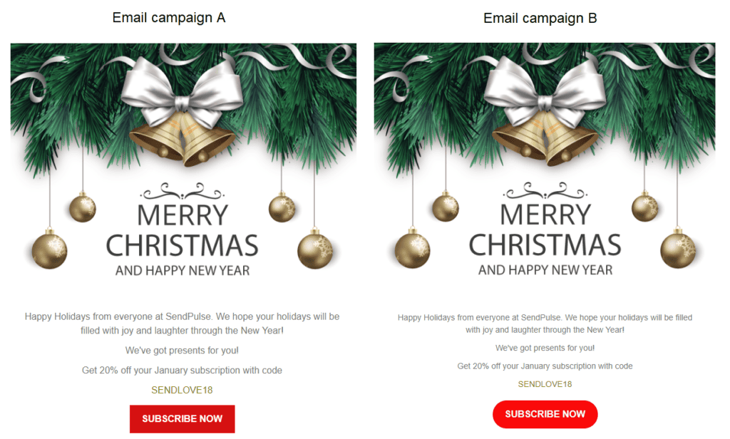
Holiday greetings are simple, effective messages you can send to your audience as the year ends to show appreciation and indicate when you might have your next sale.
However, these emails deserve as much consideration as any campaign message and require testing.
You might not notice any differences right away as you compare these two email variations. The changes are subtle, but sometimes, the subtle alterations make the most significant difference in improving open and clickthrough rates.
The first difference is the size of the text. The copy is the same between the versions, but Version A has a copy in a larger font than Version B. It’s harder to read the copy in Version B, and the smaller font creates more white space.
Another difference is the shape of the CTA buttons. Version A has a rectangular button, while Version B has an oval button.
Read also: eCommerce Product Recommendation Emails You’ll Love
3. Email content and copywriting

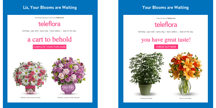
Here’s another example of A/B testing courtesy of the floral company Teleflora.
You’ll see lots of differences between these emails. Let’s begin with the most obvious one: different plants and flowers in the first email versus the second.
However, it goes deeper than that. You’ll notice that Versions A and B use different headline copy. In Version A, the headline reads, “A cart to behold,” and in Version B, it says, “You have great taste!”
The CTA button below the headline has the same neon pink color and rectangular shape between both variations but uses different text. Version A’s CTA button text reads, “Complete your purchase,” and Version B states, “Check out now.”
Read also: 2023 Guide to Email Marketing for eCommerce
eCommerce Email A/B Testing Best Practices
As you launch your first email A/B testing, keep the following best practices in mind.
Choose a good sample size
You’ll fail to get any statistical significance from asking five audience members to review your emails. However, you also don’t need 100 people.
A good sample size is several dozen customers at all sales funnel stages and across your demographics.
Don’t test randomly
It’s a waste of time, money, and resources to compare two versions of your emails just for the sake of it. You’ll also never be satisfied because you’re unsure what you’re looking for in the first place.
Create a hypothesis and use it to determine what to test and when.
Test one element at a time
If you test 10 email elements at once, you’ll never know whether your clickthrough rate improved because of one element or a combination. That can make replicating your success nearly impossible.
Take it one element at a time, determining which ones go where before adding another.
Take external factors into account
You can’t always attribute your email’s looks and copy to why it performed well. For instance, perhaps you had a ridiculously good sale, so of course, your open rate was higher than usual.
Holidays and seasonal shifts can also explain these email performance fluctuations, good or bad.
It’s worth testing emails you sent during these boon times against your current campaign to determine if your campaign is missing anything.
Read also: eCommerce Email Copy: 12 Tricks to Drive More Conversions
Bottom Line
A/B testing email marketing elements like your subject lines, word order, email design, CTA, and more can increase conversions and elevate your email performance.
You must use a good sample size for statistical significance, segment your audience, and account for seasonality during testing.
EngageBay’s automated email A/B testing tool can help you launch your next email campaign with perfect optimization. Try it free today.

